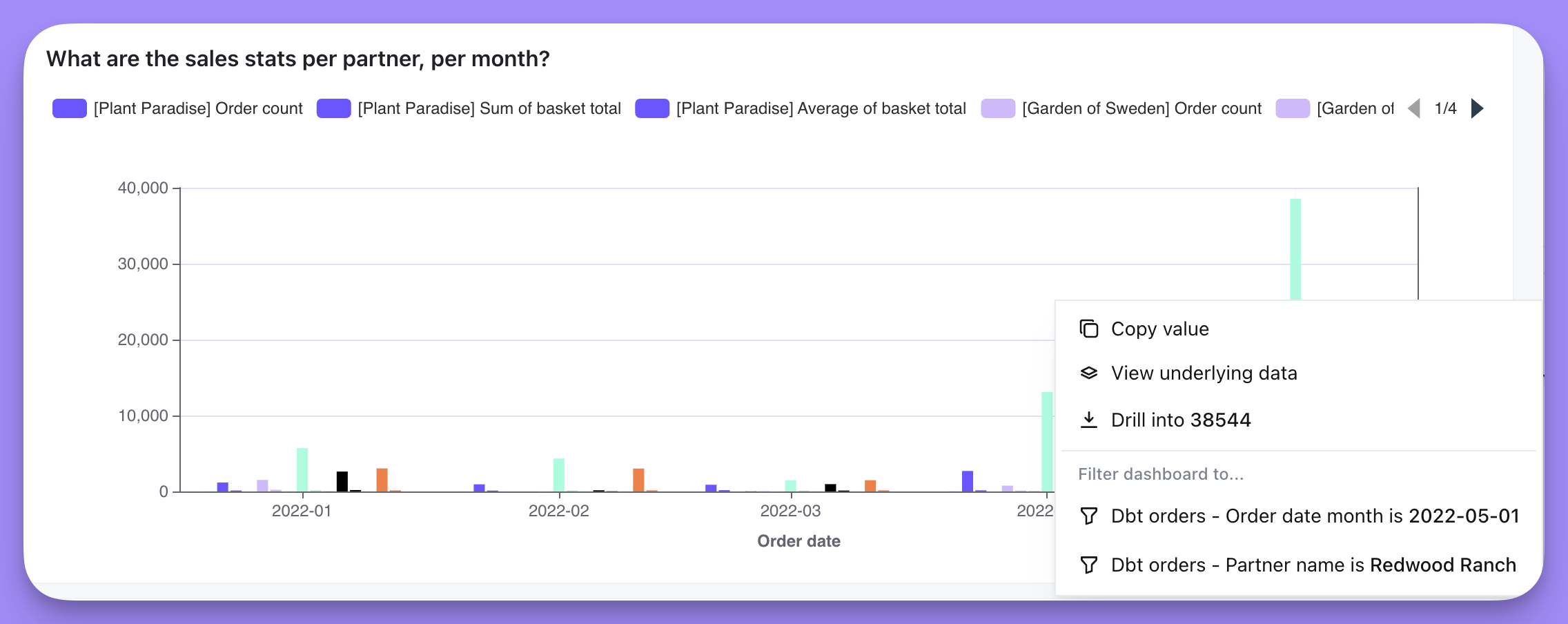
Viewing the underlying data for a point on a chart
You can click on any point on a chart and view the records which make up that data point. For example, I can find out what the underlying data is for the $4,334.0 in myWhat are the sales stats per partner, per month? chart, by clicking on the bar for that month, and then clicking View underlying data in the action menu. I’d see all of the rows in the underlying table that make up that total.
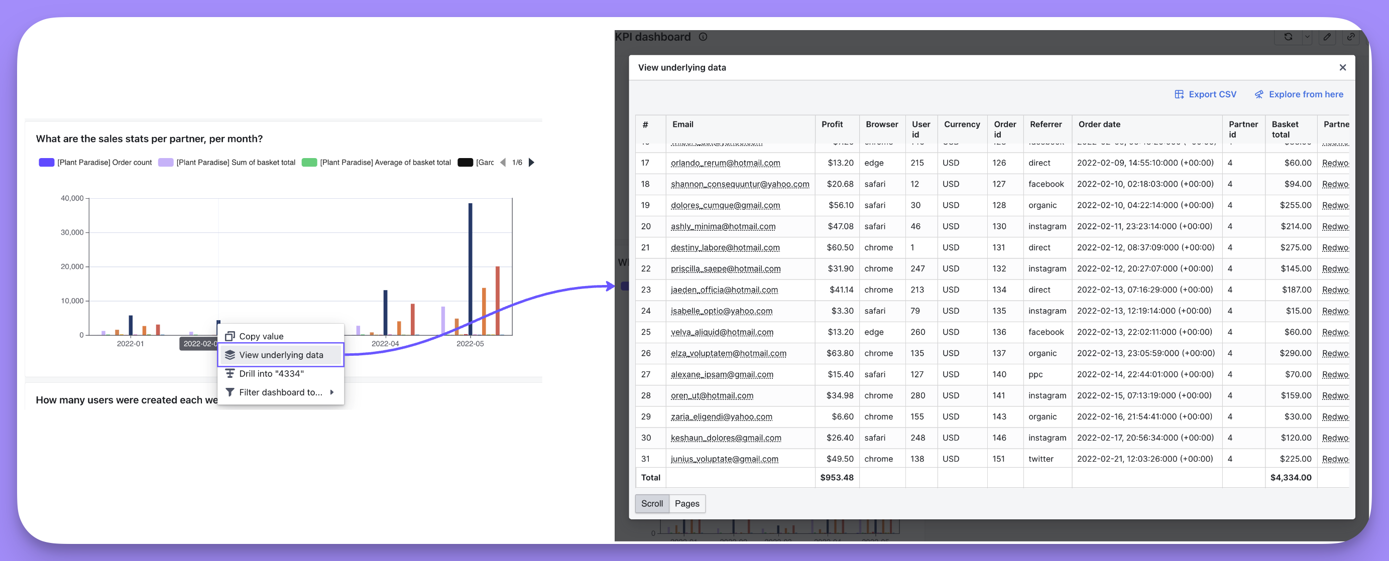
- Export this data as a CSV
- Explore from this underlying data, which will take me to a new chart with the underlying data as the starting point
Using a chart to filter your dashboard (a.k.a. cross-filtering)
When you click on the value in a chart (e.g. a bar in your bar chart), you can choose to filter on that value and update all of the other relevant charts in the dashboard. This type of chart-to-dashboard filtering is sometimes calledcross-filtering.
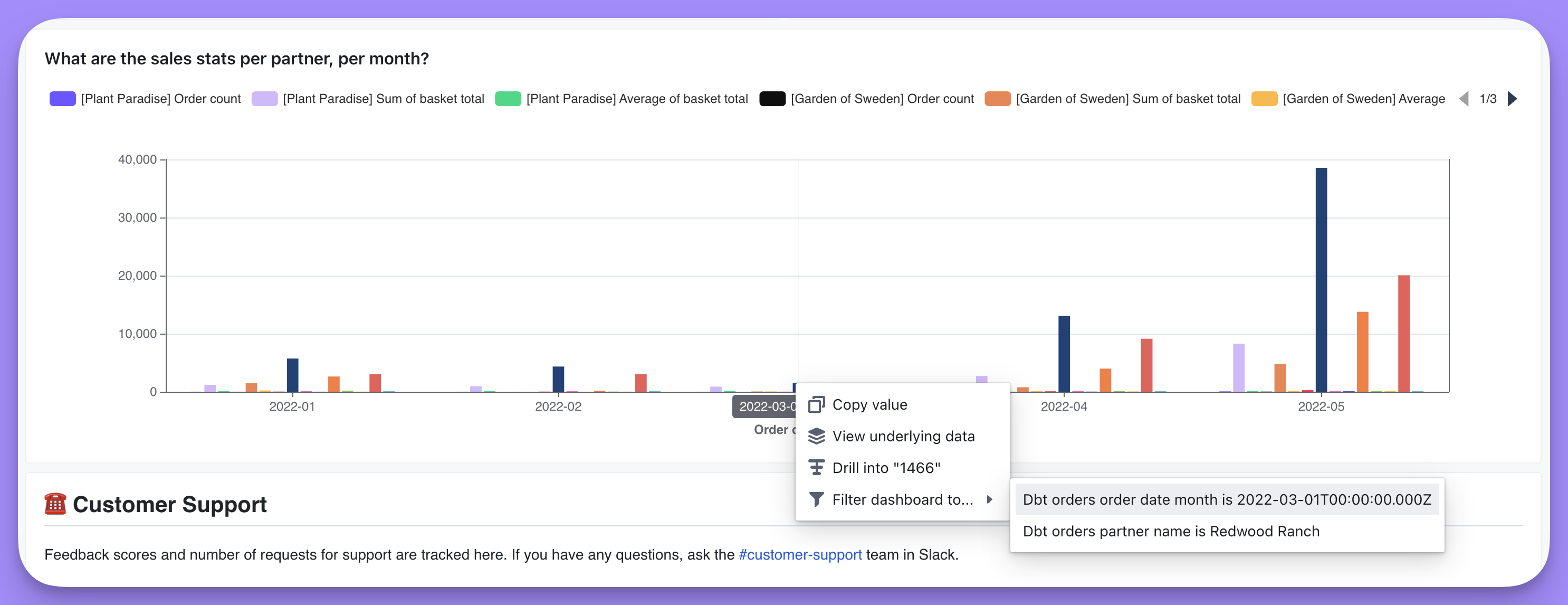
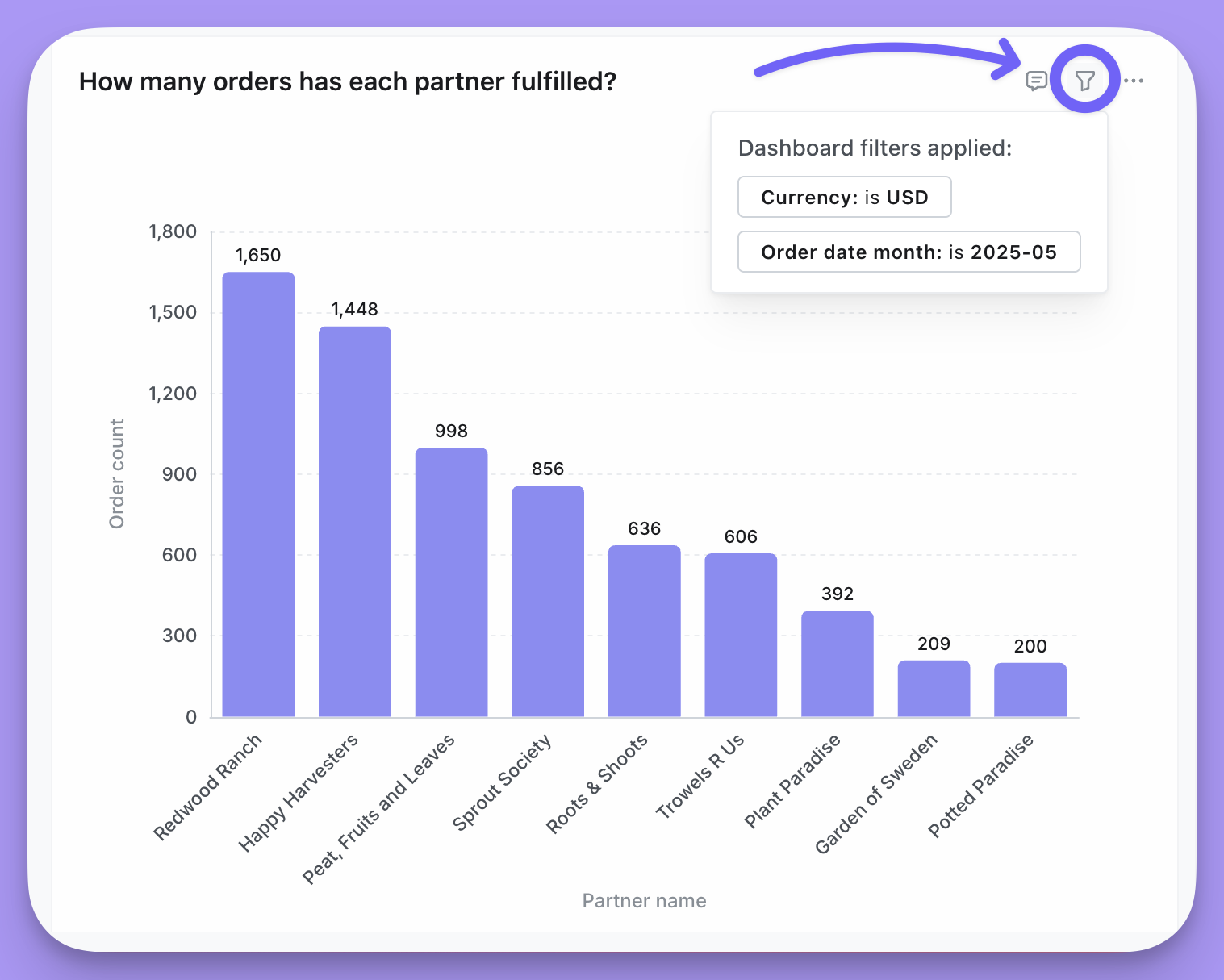
You can see which tiles had the filter applied by hovering over the dashboard filter applied text on your chart tile.
Once you’ve clicked on your filter, all of the tiles in your dashboard with the filter field will be filtered to the value you selected.
You can see which tiles had the filter applied by hovering over the tile and then on the funnel icon to see the filter that was applied.
Date zoom
Date zoom lets you change the date granularity (Day, Week, Month, etc.) of all time-based charts on a dashboard at once—without editing individual charts.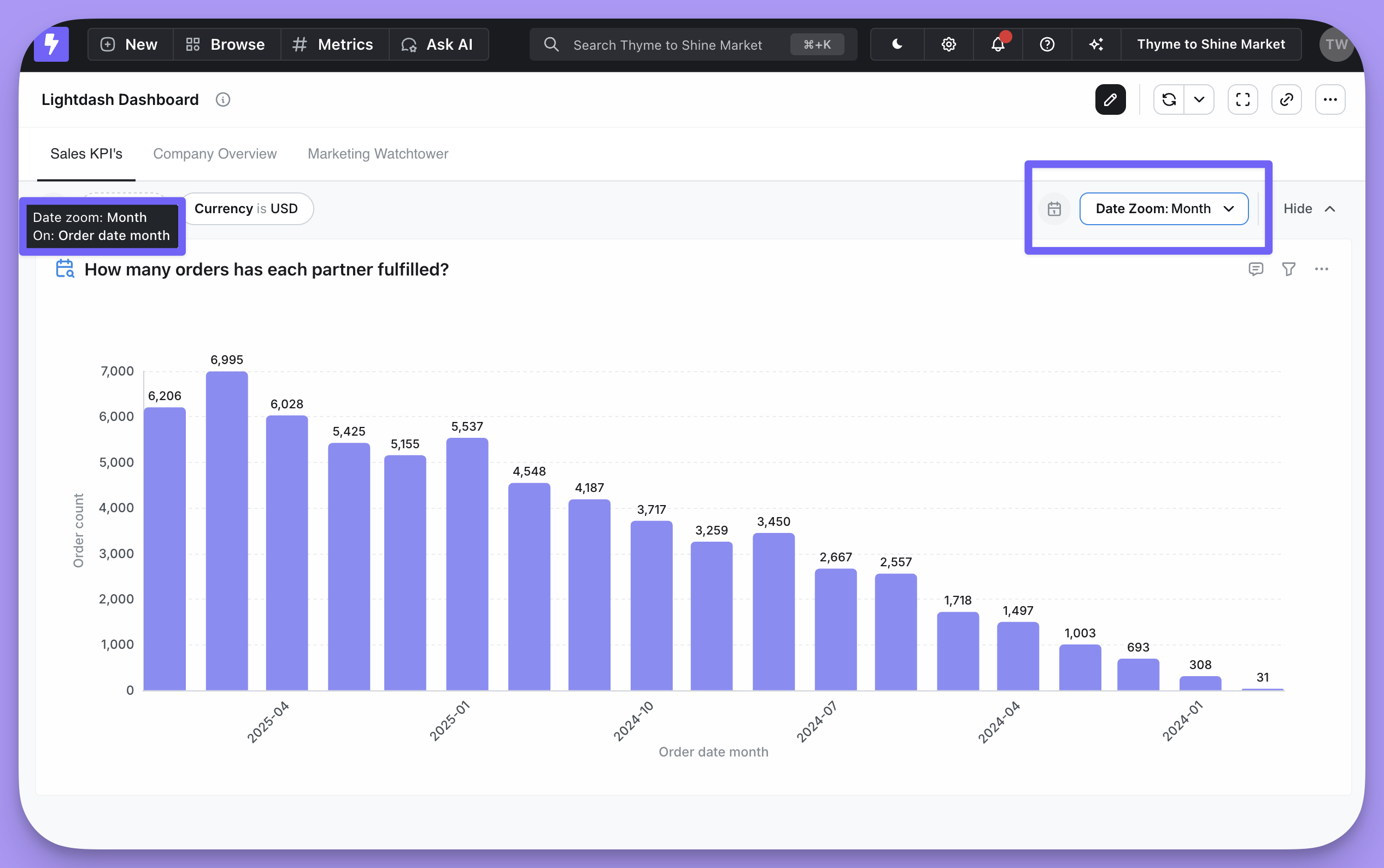
See the Date zoom guide for complete documentation, including how to configure available granularities, set defaults, and use custom granularities.
If you want to restrict access to this feature, you can hide the Date Zoom control on a dashboard by heading to edit mode and toggling the eye icon next to the Date Zoom dropdown.
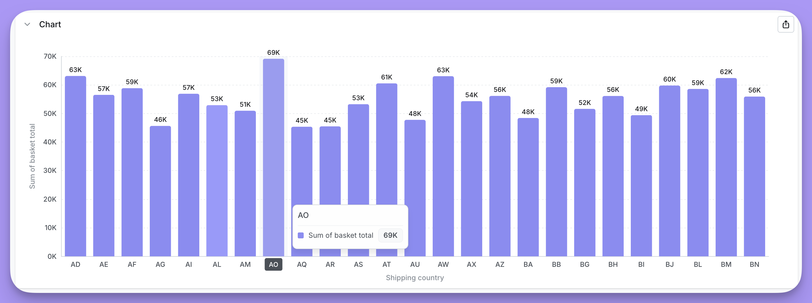
Drill into a metric in a chart or your results table using Drill into
You can drill into a Metric in your chart or results table to better understand a point in your chart. Selecting Drill into lets you group your Metric by a Dimension, like revenue segmented by (or grouped by) product type. Note that Drill into only works for Metrics, not for Dimensions or Table Calculations.
Here’s an example of Drill into
I have a chart with Sum of basket total (a Metric) per Partner, per month. As you can see, there’s a high spike in sales for one of the partners in the month of May. I want to understand why this spike happened. To do this, I click on the data point in my chart, then clickDrill into in the action menu:
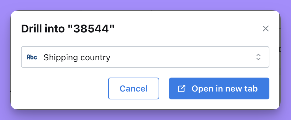
Open in new tab and see a chart with my Metric, grouped by Shipping country. Now I can uncover where this spike in sales is coming from