- Create a new dashboard
- Add charts to your dashboard
- Add markdown or other content
- Save your dashboard
- Add filters to your dashboards
- Add tabs to your dashboard
- Share your dashboard
Create a new dashboard
On the nav bar, click “New” to create a new dashboard.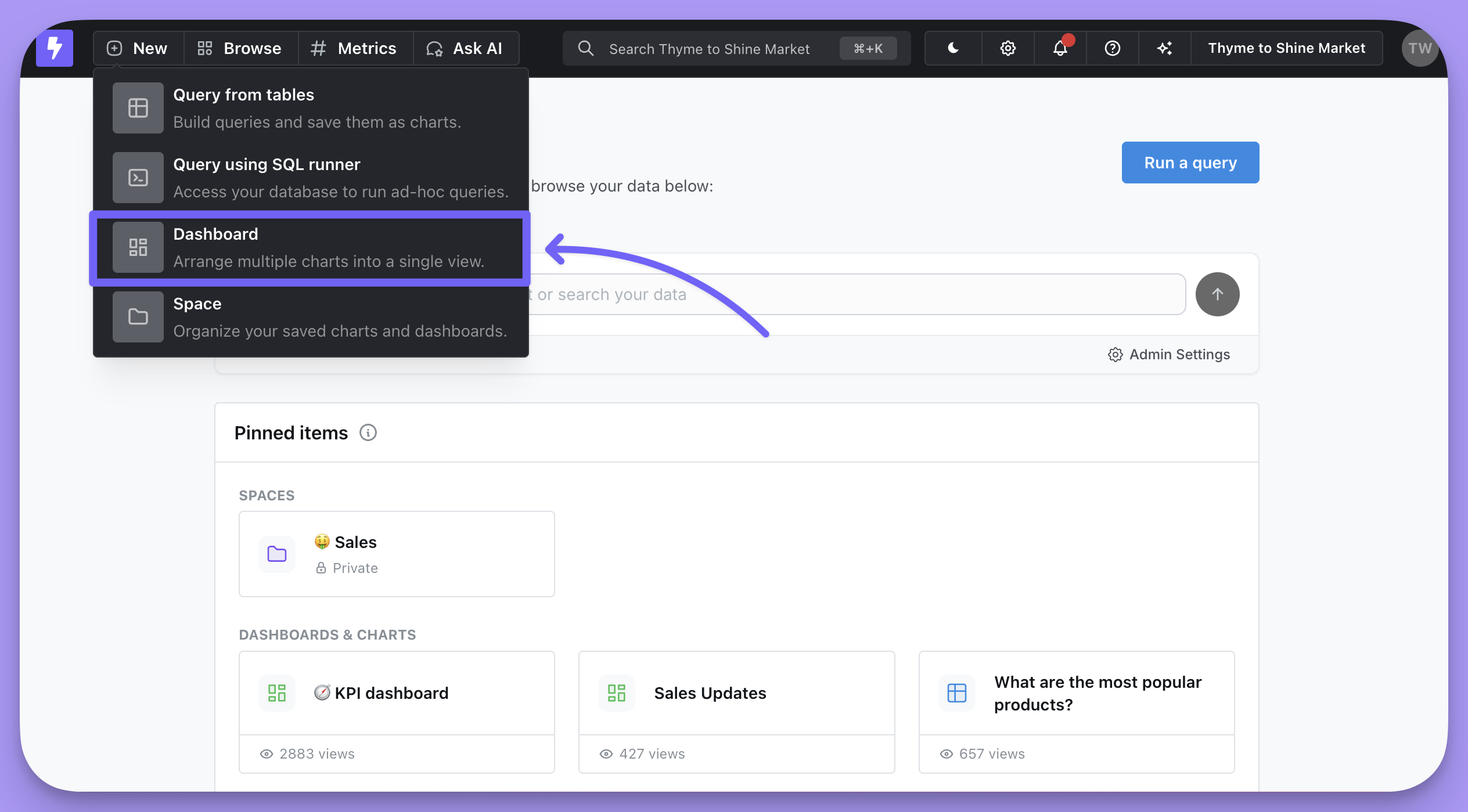

add tile button.
Add a chart to your dashboard
You can either create a new chart from within your dashboard, or you can add an existing chart.Create a new chart
Creating charts from within a dashboard helps to keep your spaces and projects clutter-free from charts that are used only once in a dashboard. Charts that are created from within your dashboard are exclusive to the dashboard. This means that they can’t be reused in other dashboards in your project. Click “Add tile” and then “New chart” to create a chart that is exclusive to the dashboard. You will be taken to the chart builder. Once you save the chart it will appear at the bottom of your dashboard.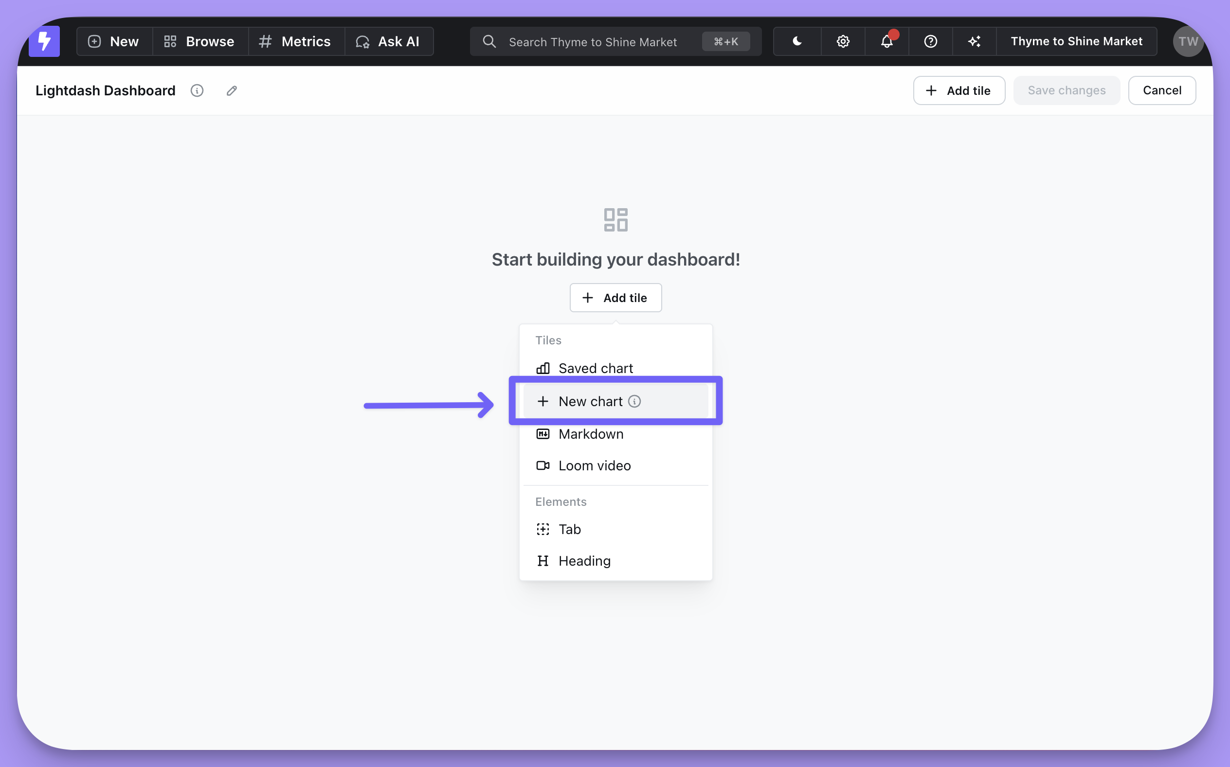
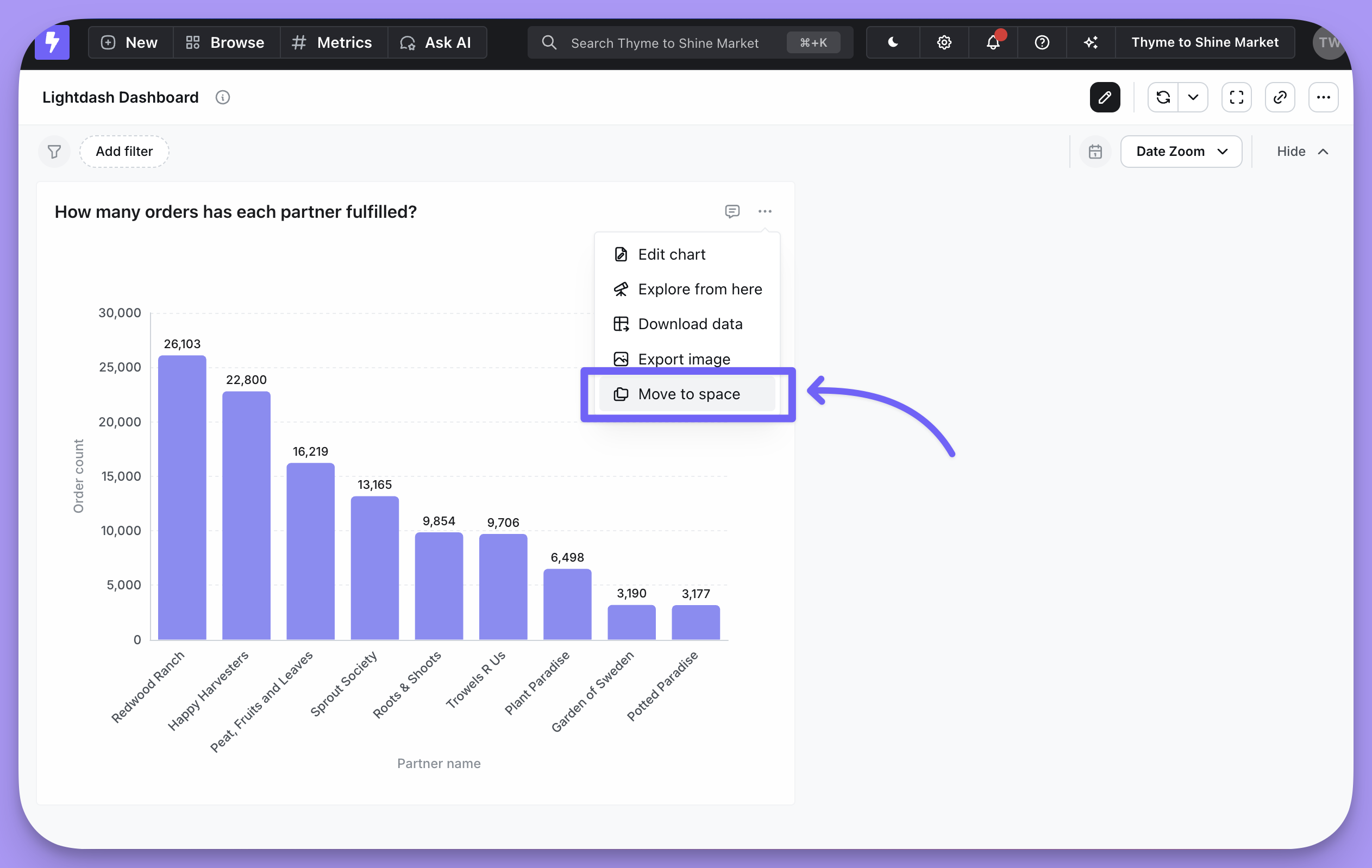
move to space option from the chart’s three-dot-menu.
Add an existing chart
You can add an existing chart to your dashboard by clicking “Add tile” and then “Saved chart”. Clicking any chart will add it at the bottom of your dashboard.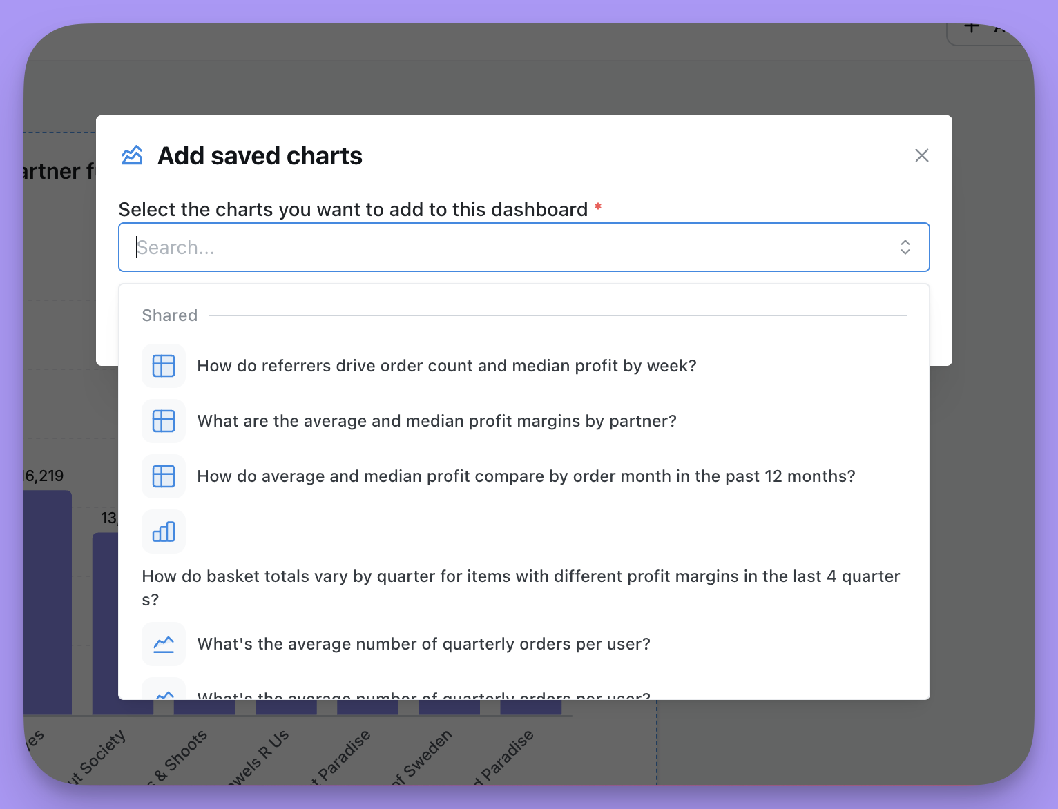
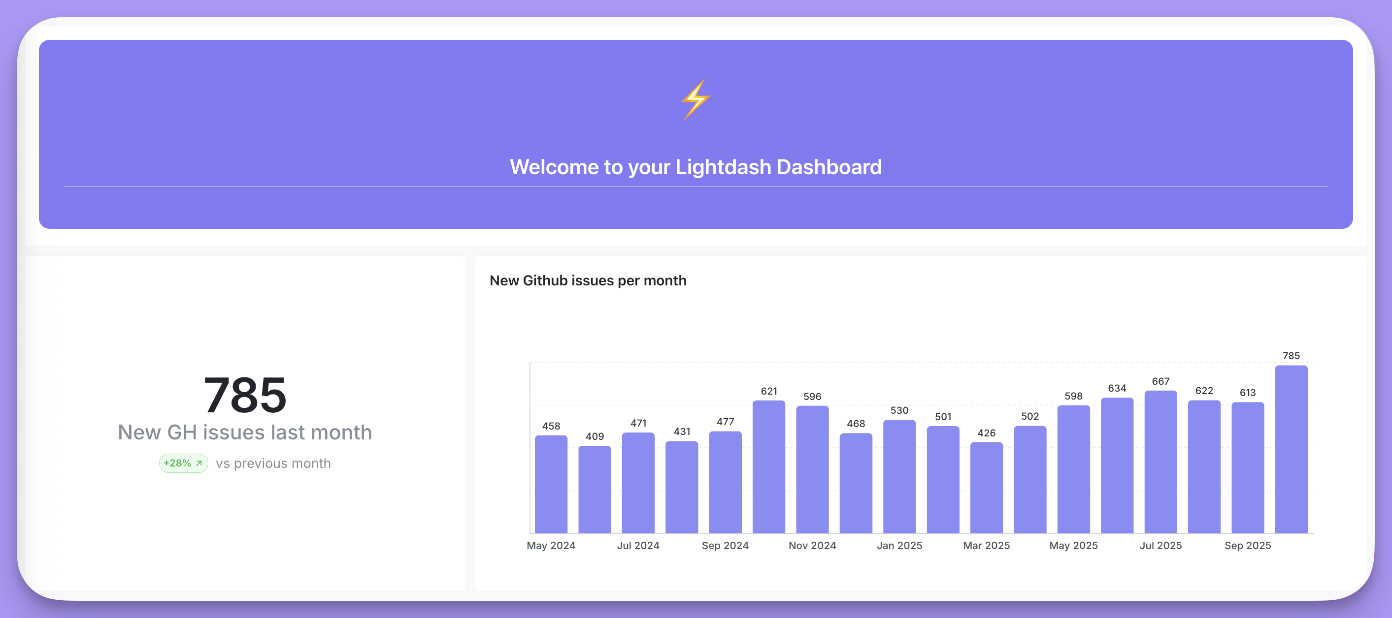
Add markdown or other content
In addition to charts, you can also add markdown tiles or embedded Loom videos to explain the dashboard to people who will be using it.Markdown tiles
These tiles are very flexible and allow you to enter text with headers, formatting, etc. You can even include code blocks and images within markdown tiles. The built-in editor provides most formatting you’ll need. You can add images hosted on the web like your company logo. Just paste the image URL into the markdown tile using standard markdown image syntax:![]() (example below) and it will be rendered as an image.
Responsive images
To make images scale properly when dashboards resize, use inline CSS styles with responsive properties. This prevents images from getting stretched or distorted on different screen sizes.max-width,min-width- Control width boundsmax-height,min-height- Control height boundsheight:auto- Maintain aspect ratioobject-fit- Control how images fit (e.g.,contain,cover)
Other HTML markdown tile options
Other HTML markdown tile options
Loom tiles
All you need to do for embedding Loom videos is click on the Loom video option and enter a URL and title for the tile.Save your dashboard
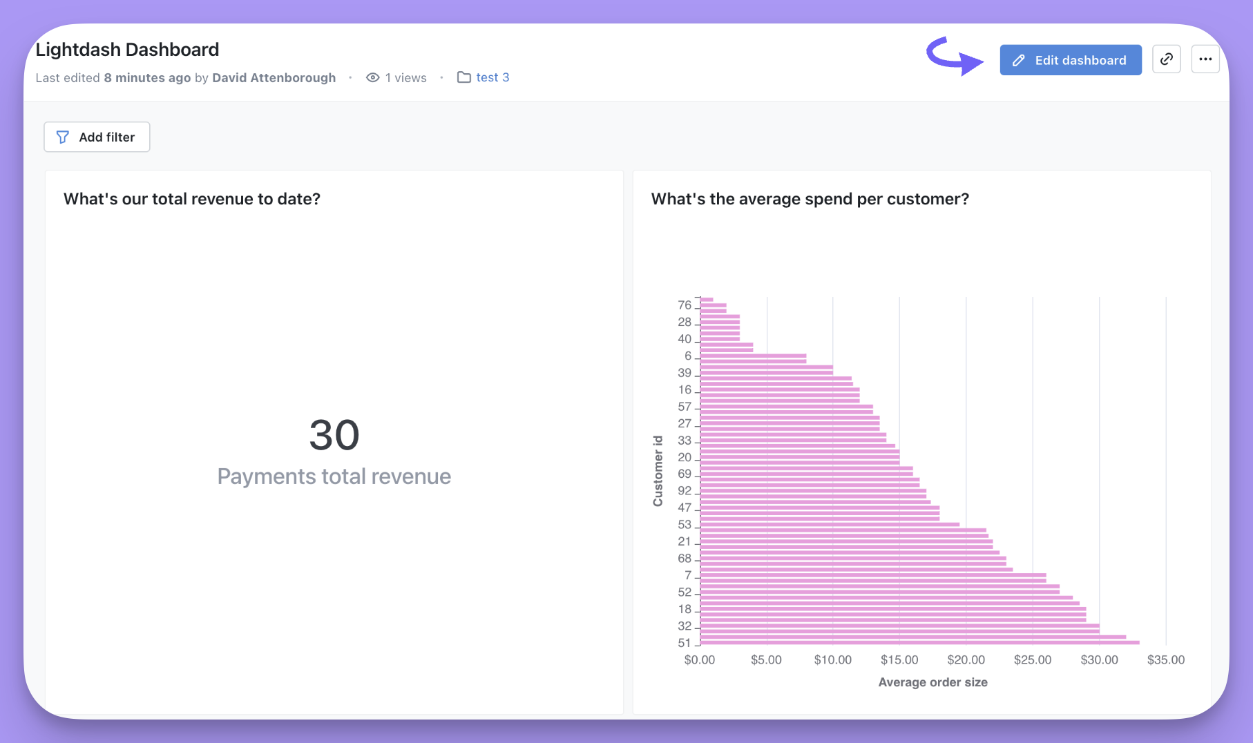
When you’re happy with the layout, hit “Save”. You can also see all of the saved dashboards in your project by clicking onBrowse —> All Dashboards.
Add filters
Now let’s add some filters to your dashboard. First, start by editing your dashboard by clicking on theEdit dashboard button.
Add filter button to add a new filter to your dashboard by selecting a field and a value to filter by.
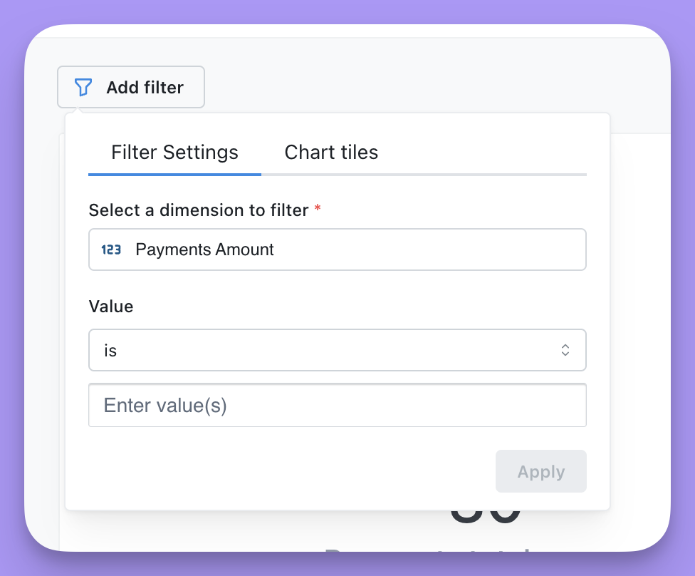
Apply. You can add as many filters as you like.
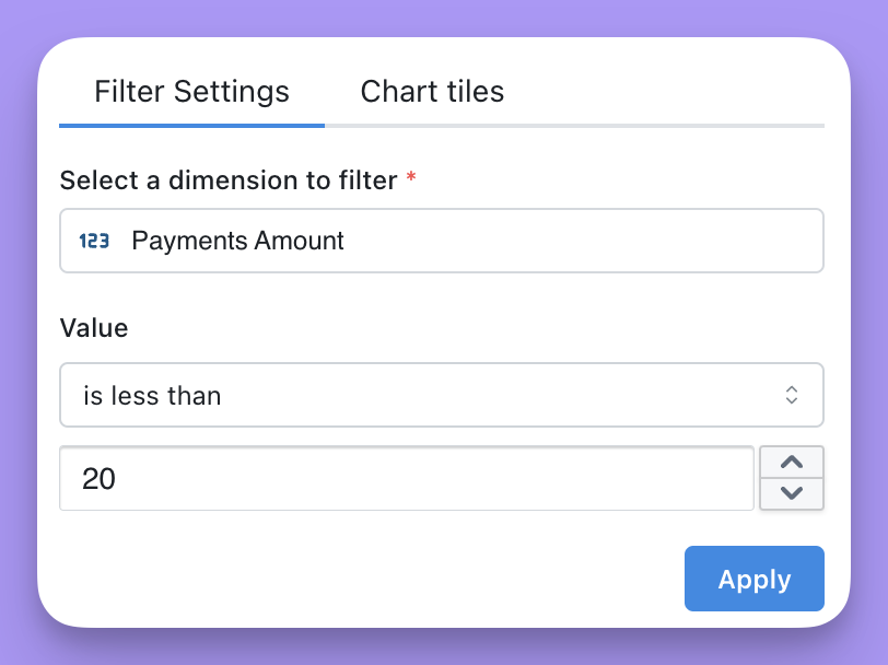
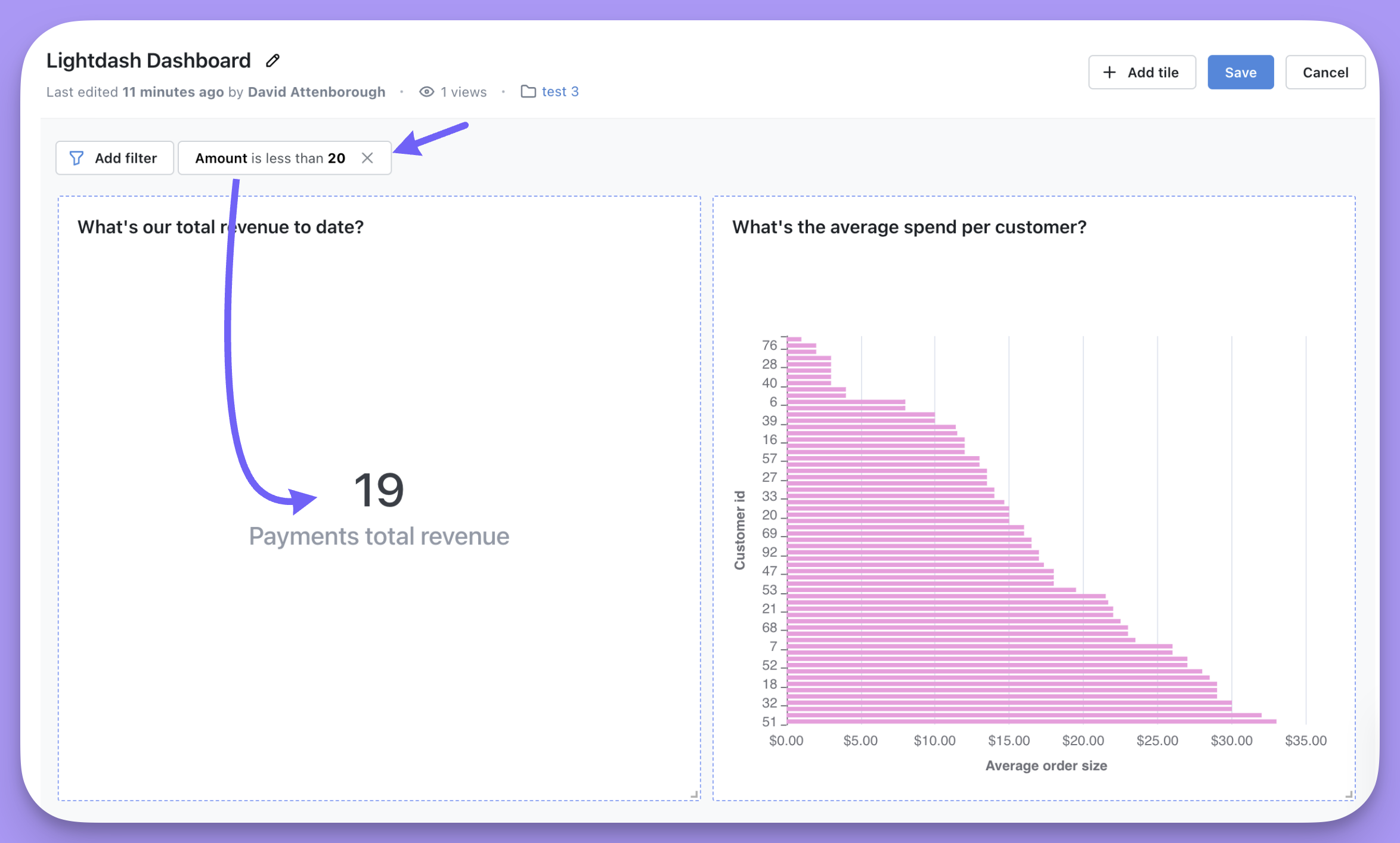
Save to save your dashboard with the new filter.
Leaving filters empty
You might want to add an empty-value filter so that your dashboard viewers can choose their own value and explore the data based on their own criteria. Your dashboard viewers might also want to add their own filters to your dashboard.Adding an empty-value filter
Just edit your filter and ensure that you don’t provide a default value.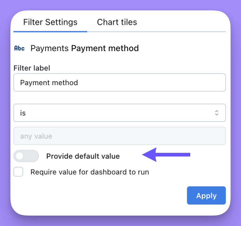
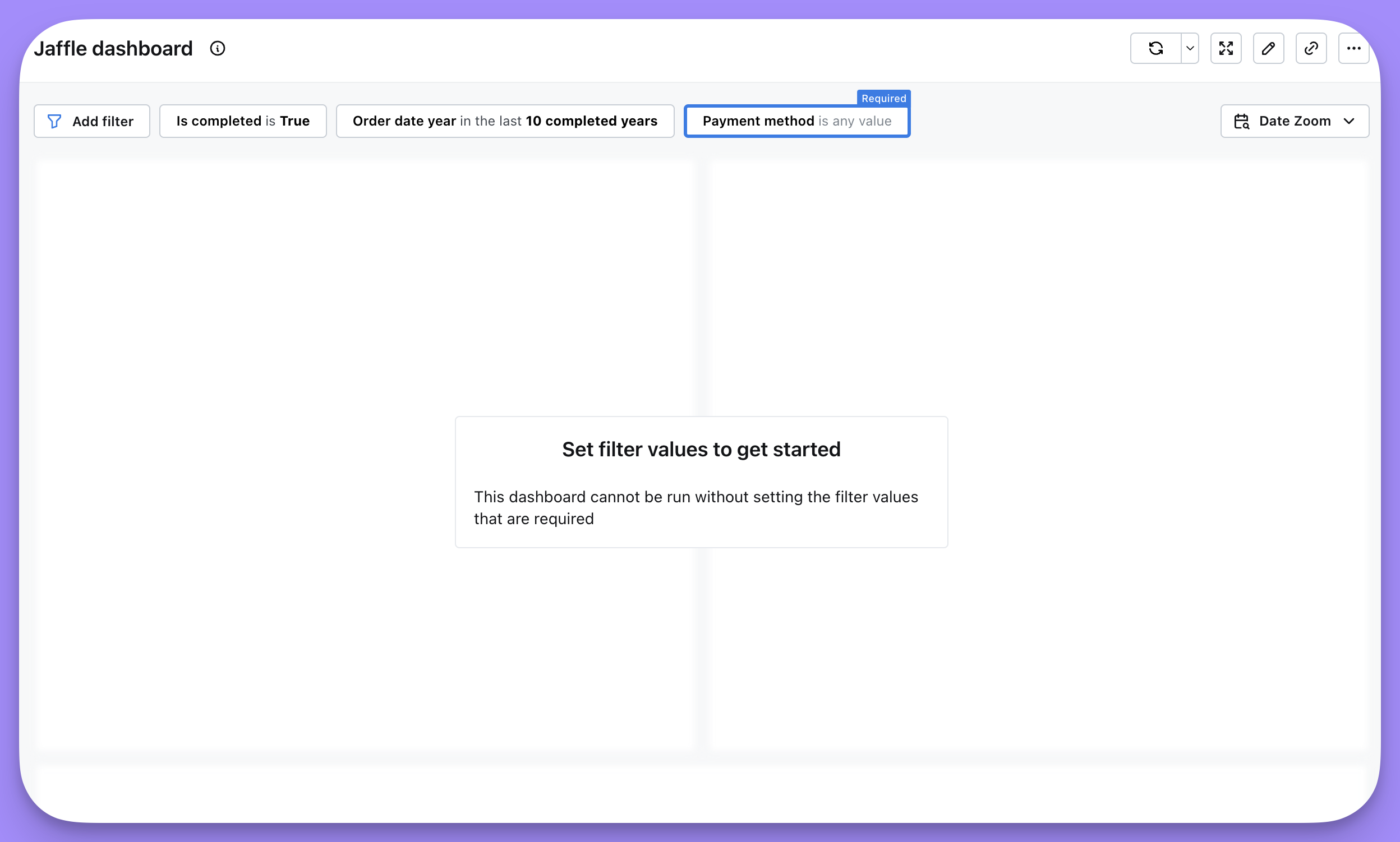
Marking a filter as required
You can require viewers to pick a filter value before the dashboard loads. This is useful for dashboards built on large datasets, where running queries without a filter would be slow or expensive. Edit your filter and check the “Require viewers to pick a value to load the dashboard” checkbox. The dashboard won’t run until each viewer selects a value, and values aren’t saved between visits — every viewer is prompted to choose their own. Any value you set while configuring the filter is intentionally cleared when you save the dashboard, so this option can’t be combined with a default value.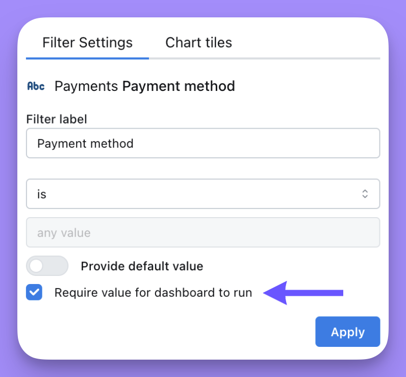
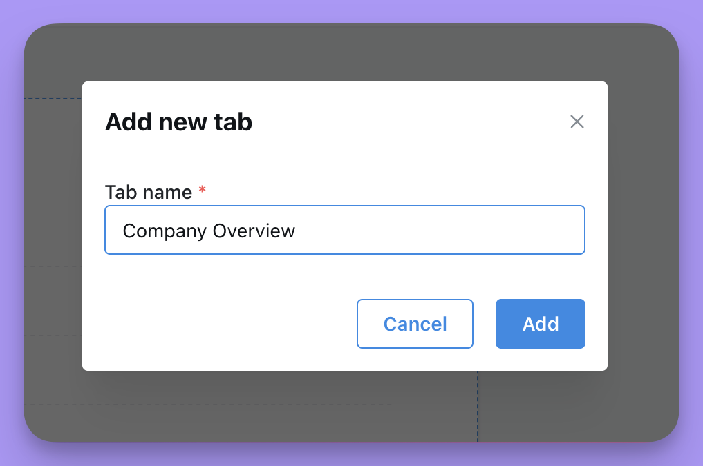
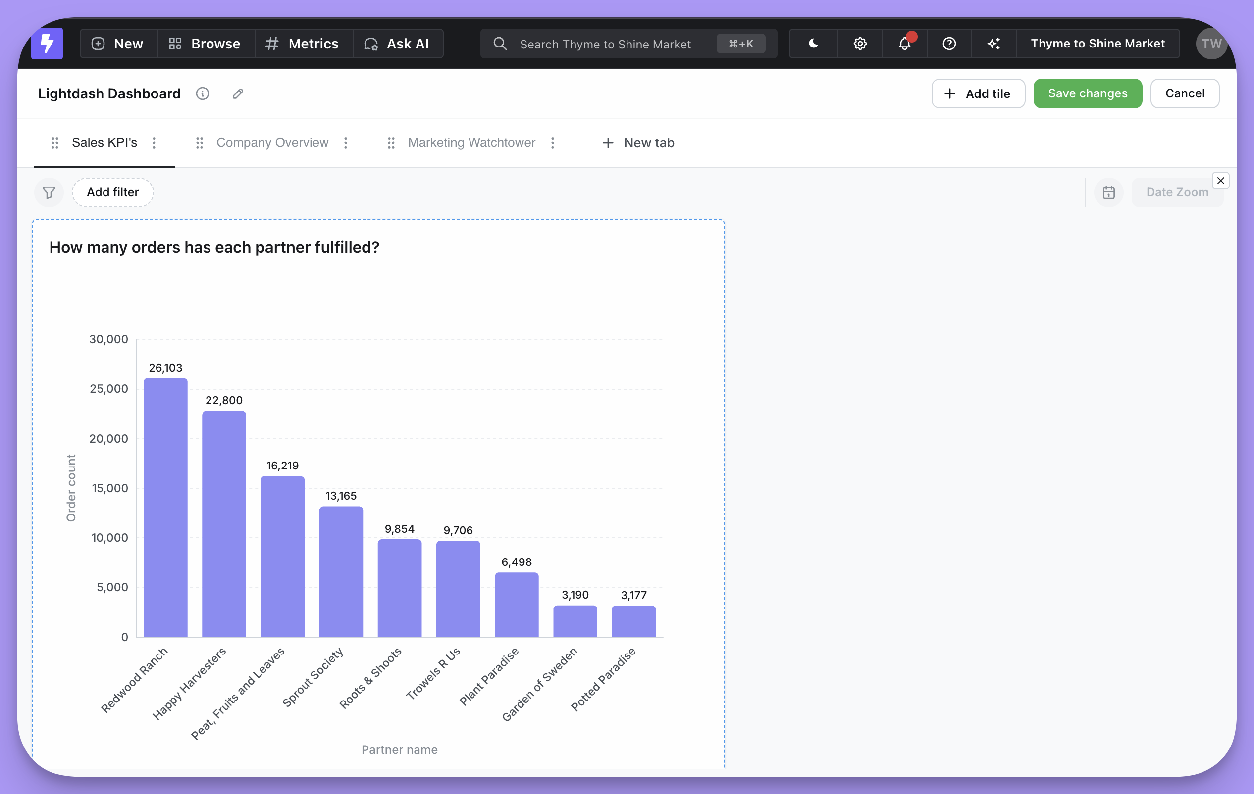
Add tabs
As your dashboard grows you may find it supporting multiple teams and use cases. Lets add tabs to your dashboard for better organization! While editing, click “Add tile” and then “Add tab”.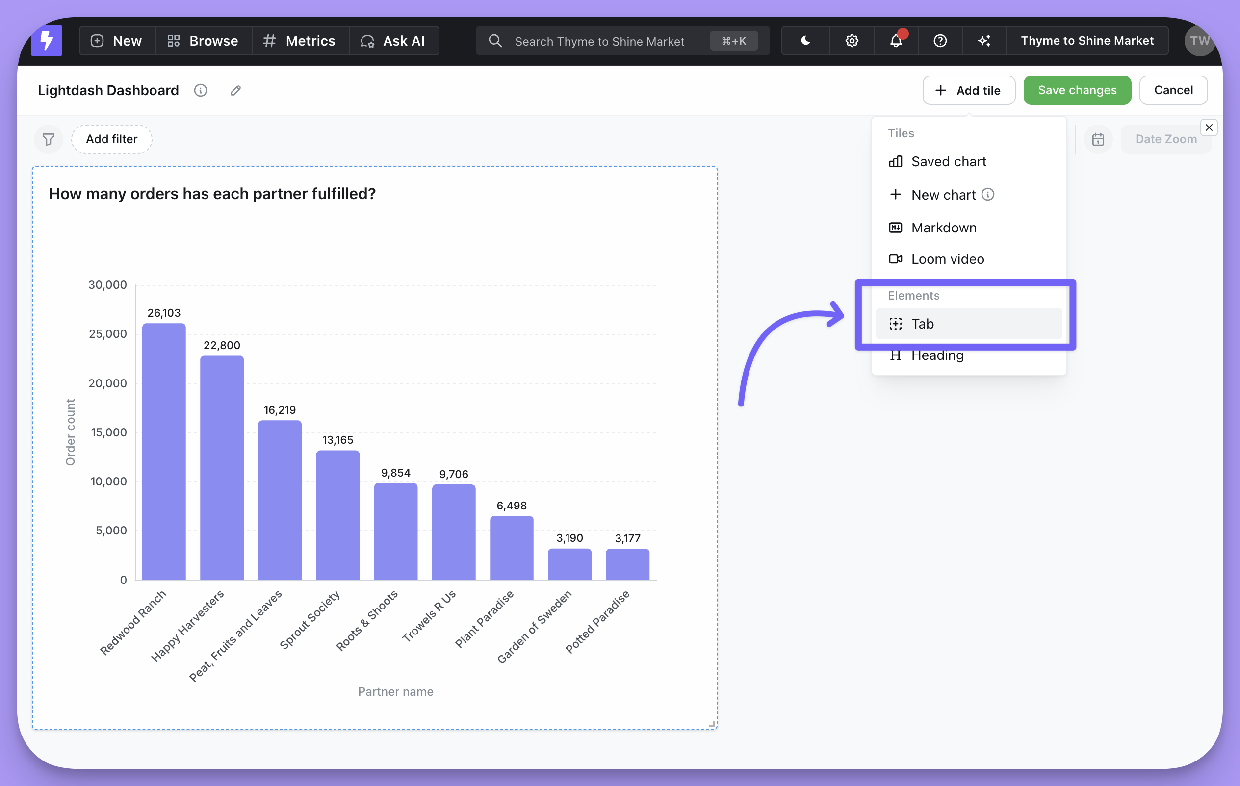
Editing and removing tabs
To edit a tab, click on the edit icon to the right of your tab name while in dashboard edit mode. You can either rename or remove the tab from your dashboard.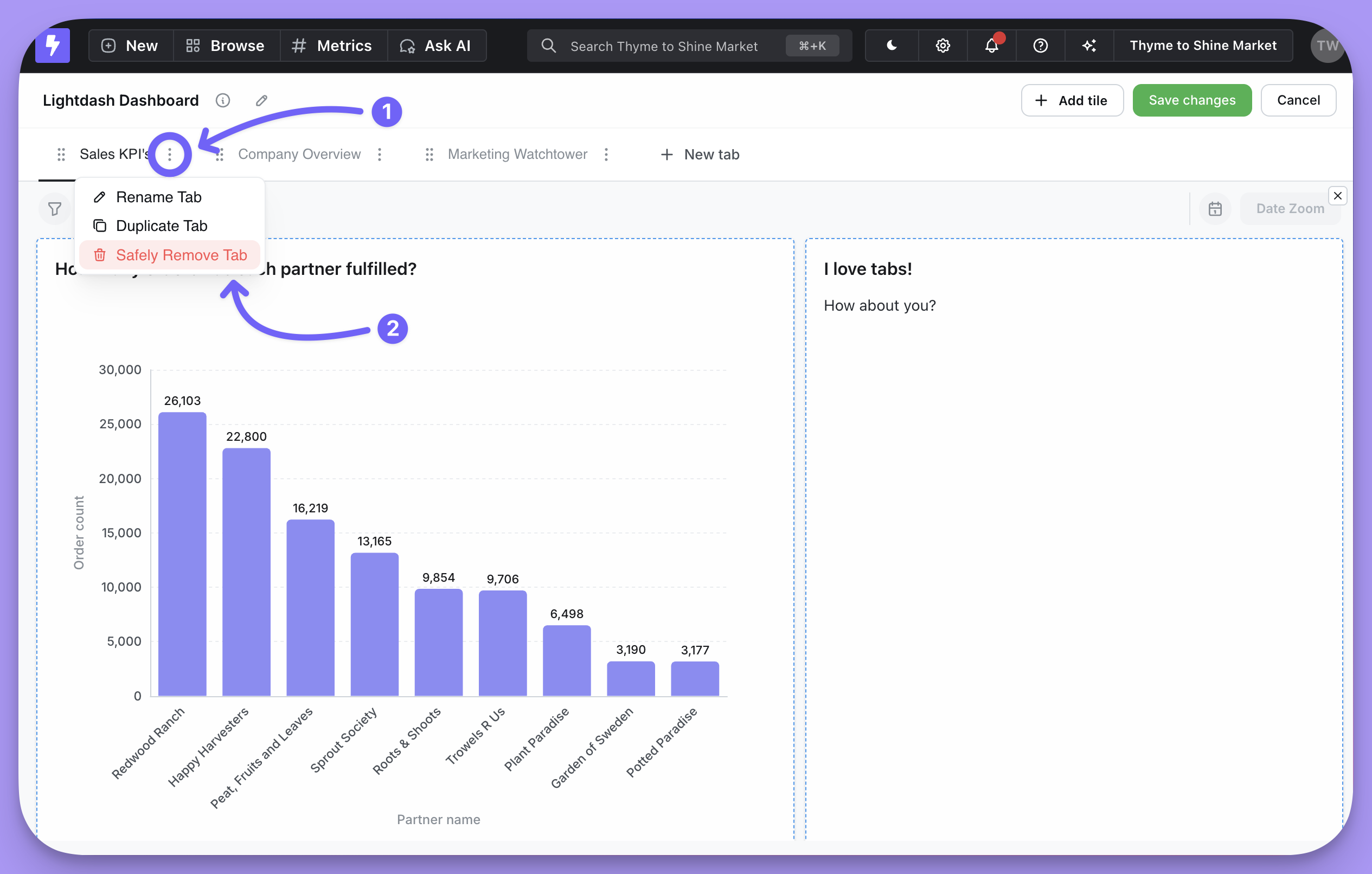
Sharing tabs
You can share tab content just like you would a regular dashboard. Sharable links will navigate right to the tab that was active when you created the shareable link.Embedding dashboard tabs
Embeddings with tabs work slightly differently. When embedding a dashboard with tabs, all the tabs will be appended to the dashboard. In this case, the embeddeding will be one dashboard with all content from all tabs.Hide tile headers
You can hide the header of any tile on your dashboard to create a cleaner look or to give more space to the chart content.- Enter edit mode by clicking the
Edit dashboardbutton - Click on the tile you want to modify and select
Edit tile content - Click the eye icon next to the tile title to hide it