Now that you’ve connected your dbt project to Lightdash, it’s time to start exploring your data.
A Table is the main starting point for exploring data in Lightdash. It contains a group of related dbt models, dimensions, and metrics. You explore Tables in the Explore view.
An intro to tables and the explore page
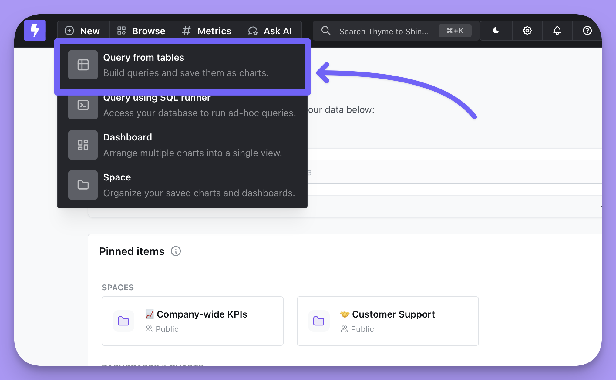
To start a new query, click on [+] New —> Query from tables, then select the table that you want to explore.
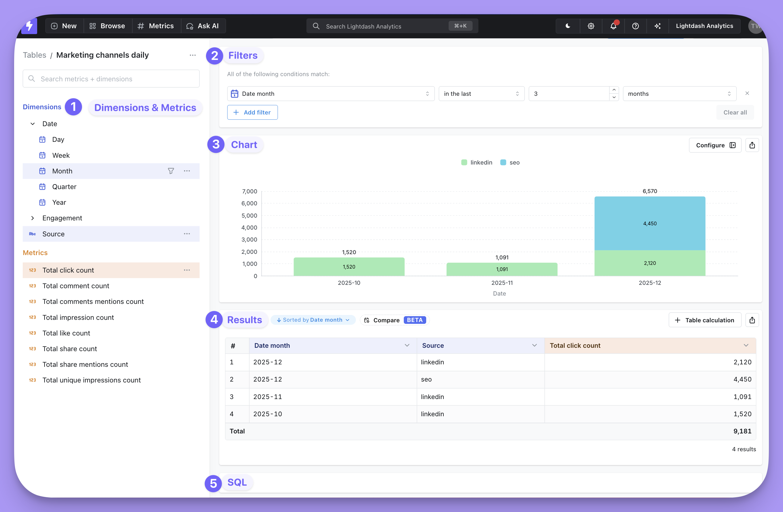
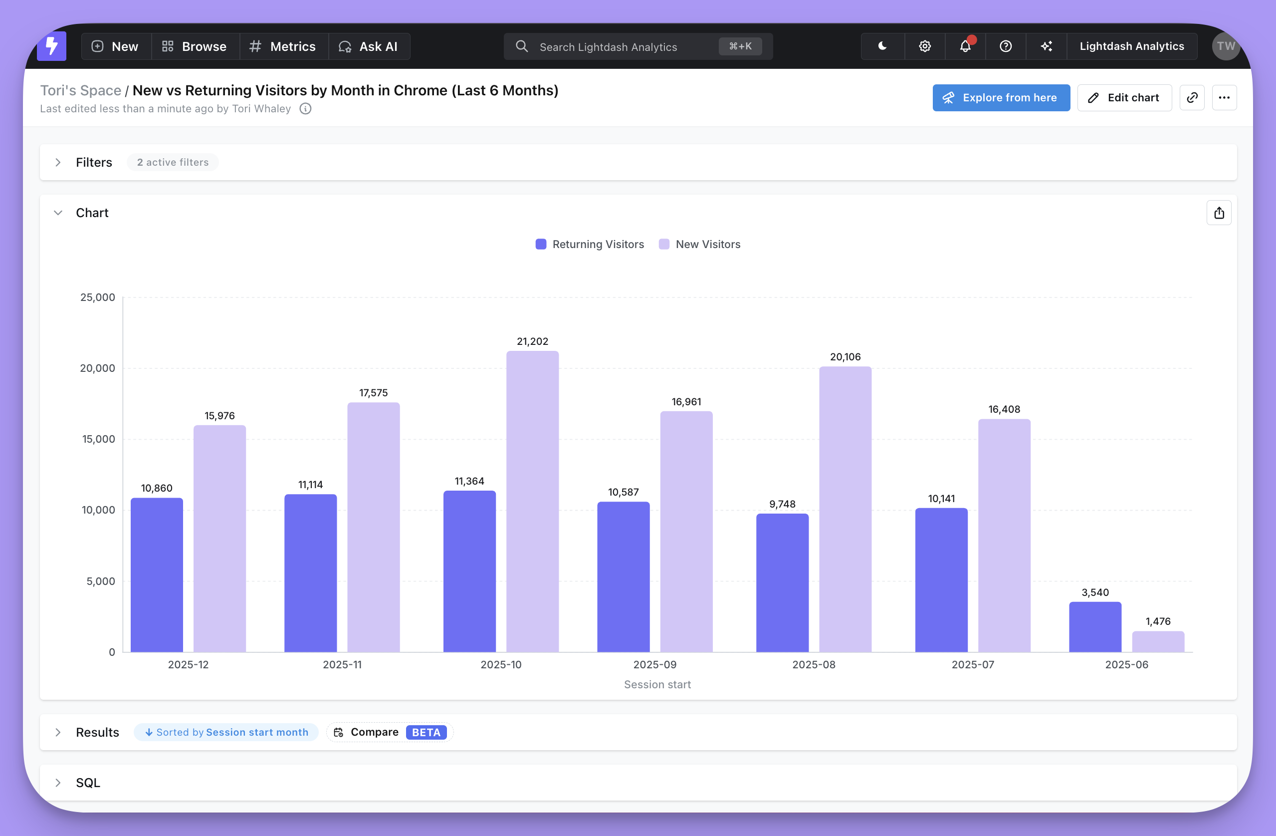
The explore page is made up of five main areas:
- Metrics and Dimensions that are available on the table you selected
- Filters, which lets you restrict the data in your query
- Chart, where you’ll visualize your query results
- Results, the raw data returned from your database
- SQL, shows the generated SQL that produced the results
Select your fields
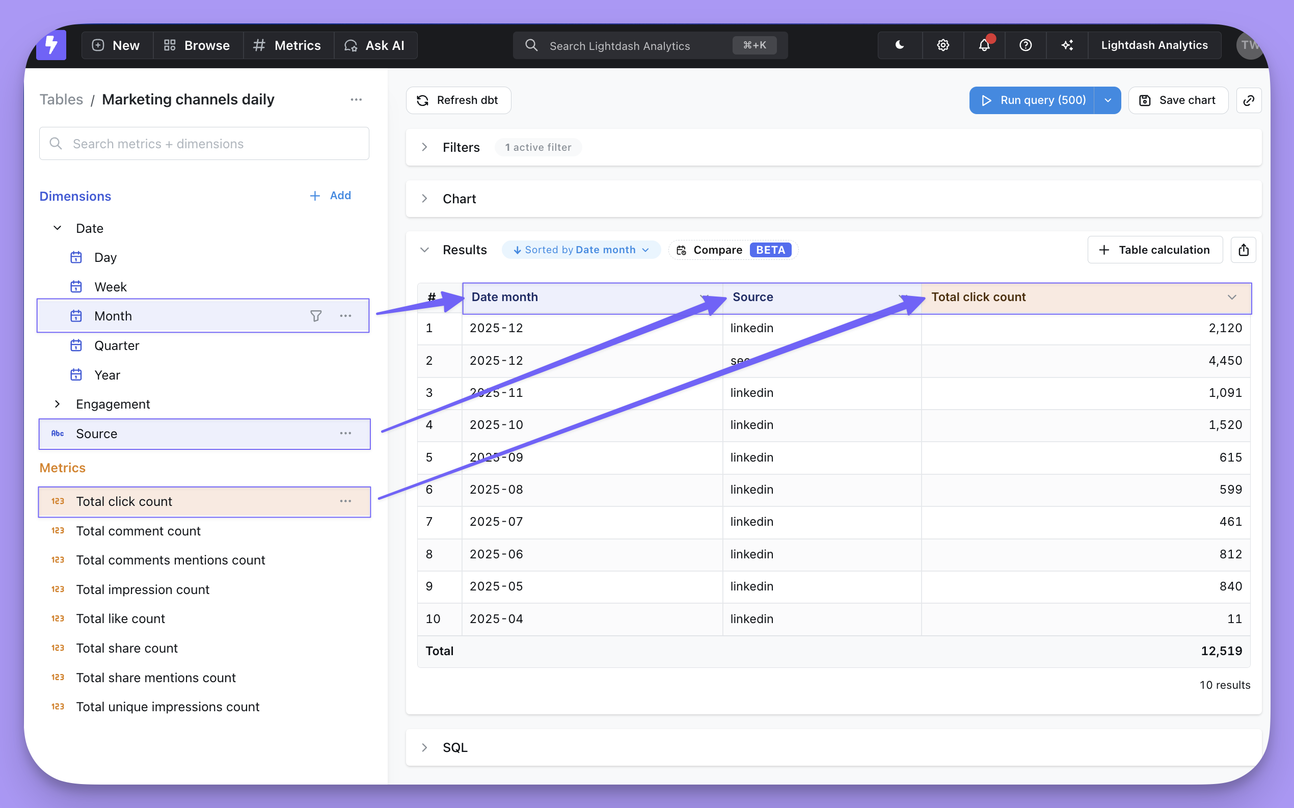
To run a query:
- Select a metric to calculate
- Select one or more dimensions to split the metric into groups
- Hit Run query in the top right
For example, if I wanted to know the “number of orders per month split by partner”, I’d select the Order count metric, the Order month dimension, and the Partner name dimension, to split by partner.
Filter results
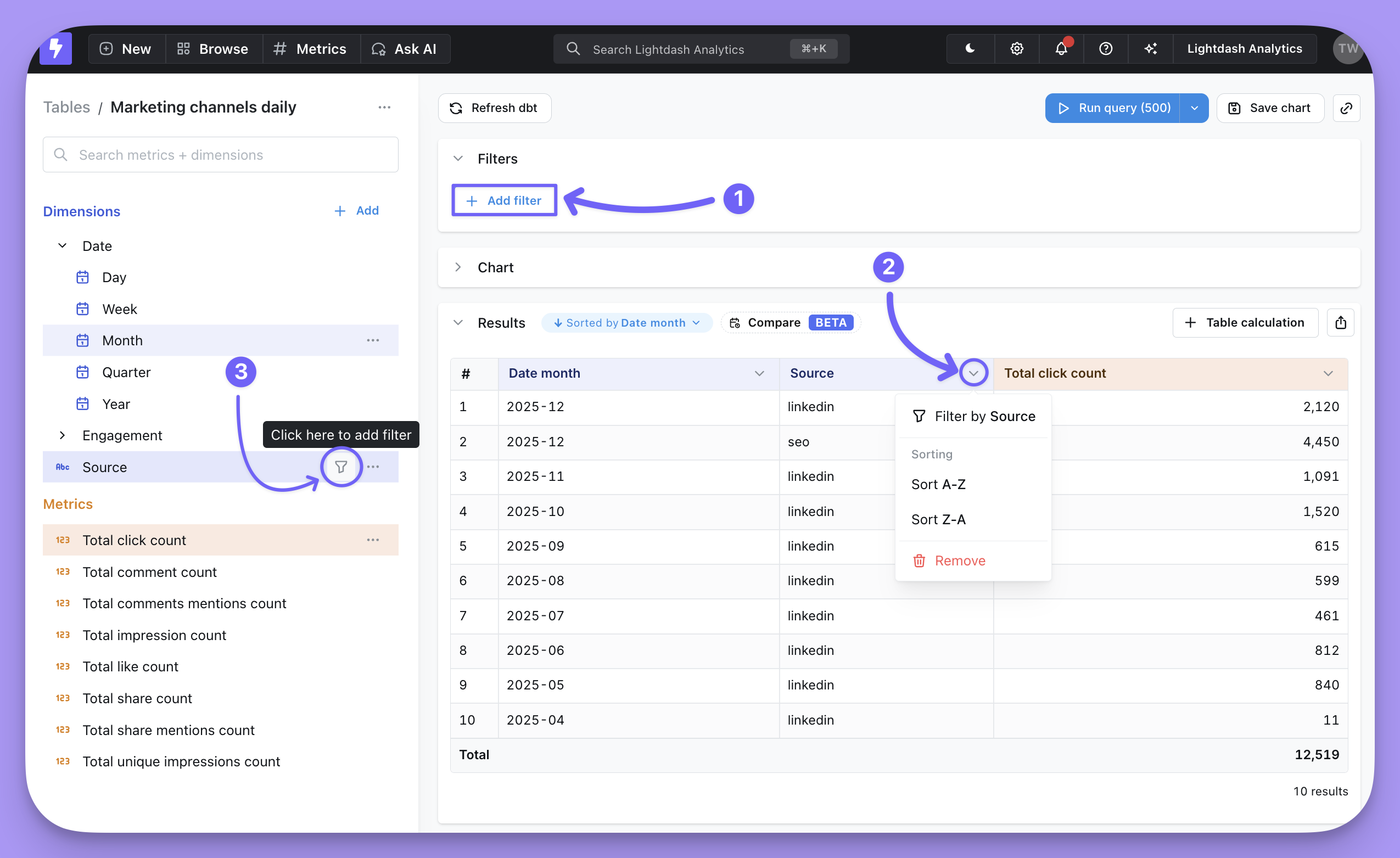
You can add filters in a few different ways:
- Click
+ Add filter in the Filters section.
- Open the column header menu in the Results table, then
Filter by [field name].
- Click the filter icon that appears when you hover over Dimensions and Metrics.
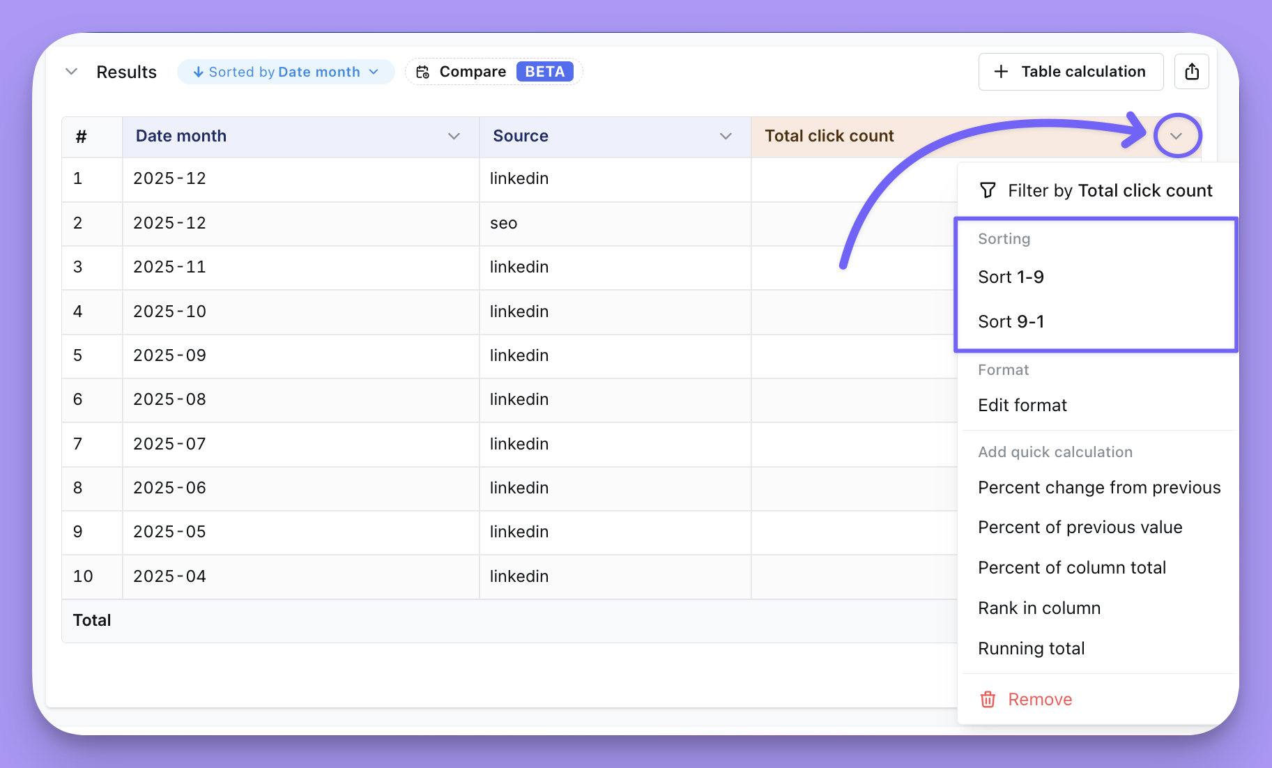
Sort results
Click on the arrow in the table header for the field you want to sort by.
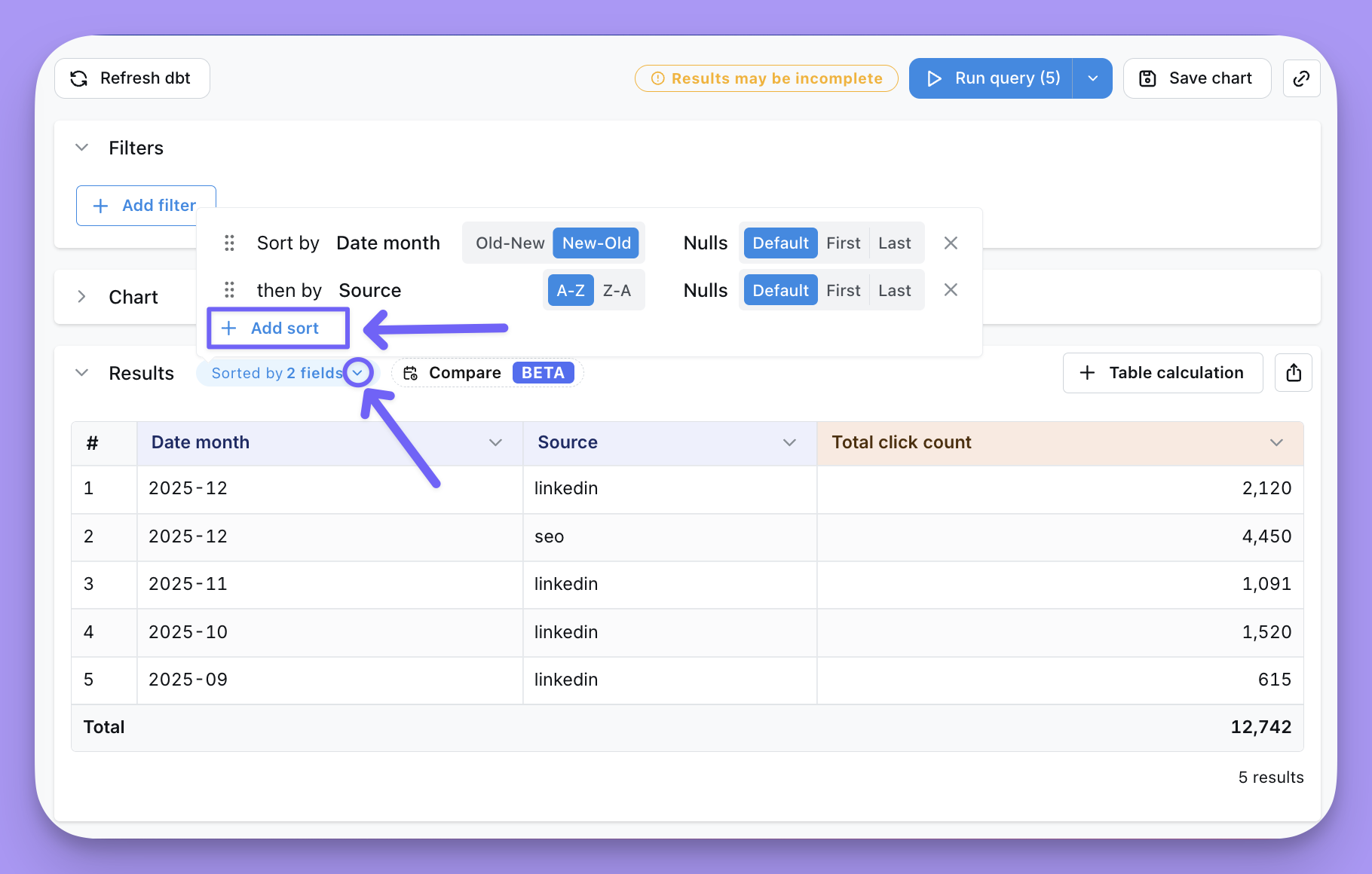
If you want to sort by multiple fields, click the blue pill that displays the current sort, then choose + Add sort.
Here is the expected behavior of the sort menu:
- When you add a sort by clicking on a column header, that sort will overwrite any previous rules.
- After using the sort menu to sort by multiple columns, you can drag-and-drop columns to rearrange the order.
- Remove a sort by clicking the
X to the right.
- Change the order of a column’s sort using the toggle next to the field name in the sort menu.
Sorting NULL values
You can specify whether NULL values should appear first, last, or use your database’s default sorting behavior.
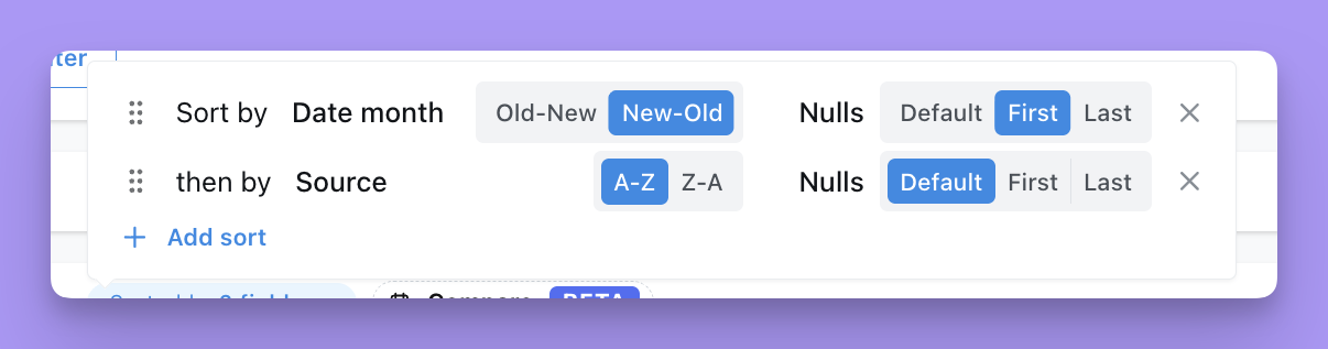 To configure NULL sorting:
- Open the sort menu by clicking the blue pill that displays the current sort
- For each sort field, use the NULL sorting control to select your preference:
- Nulls first - NULL values appear at the top of the results
- Nulls last - NULL values appear at the bottom of the results
- Default - Uses your database’s default NULL sorting behavior
The NULL sorting behavior is applied to the generated SQL query using NULLS FIRST or NULLS LAST clauses in the ORDER BY statement.
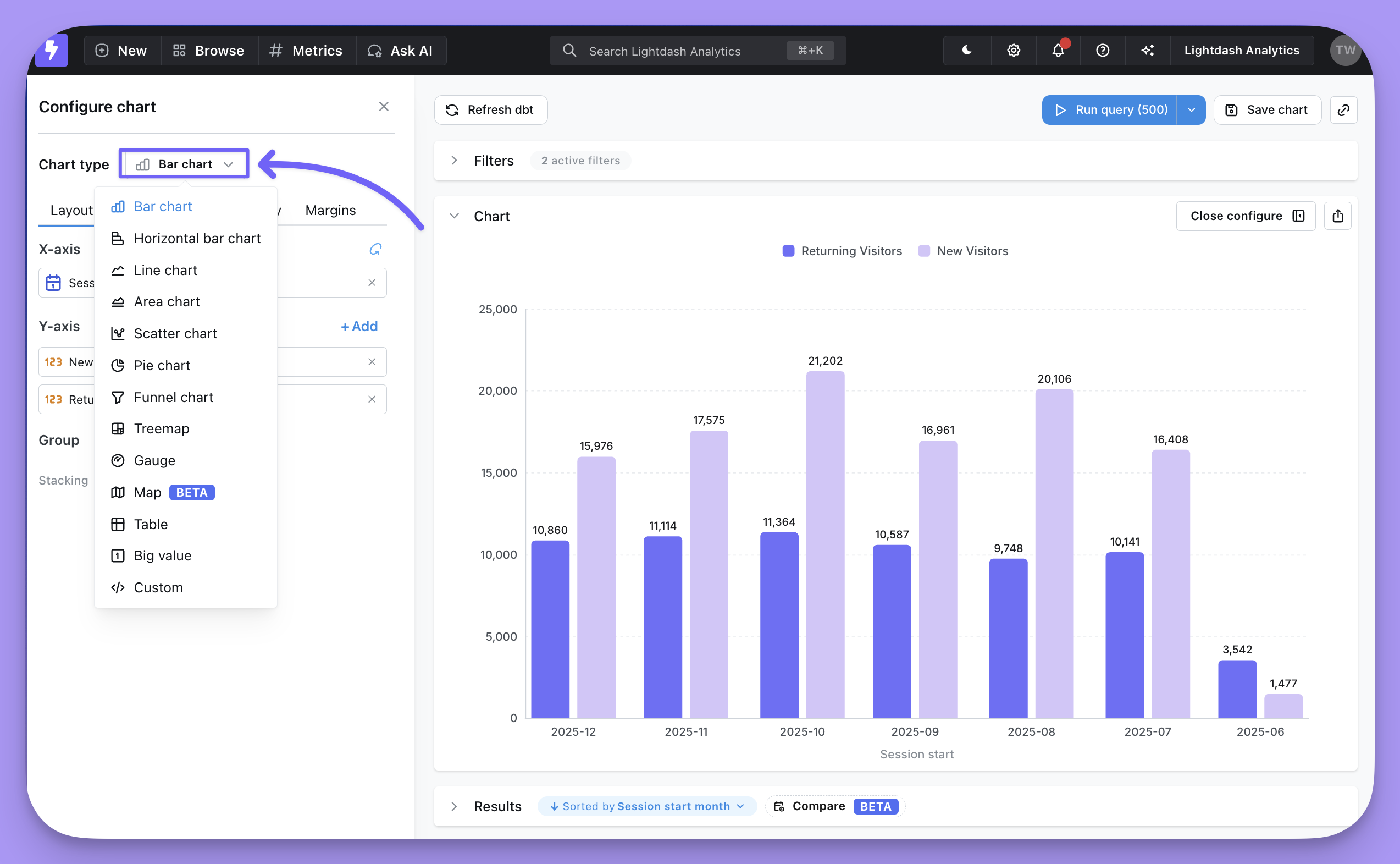
Build a chart
Once the query runs, your data will appear in the results table. You can then open the Chart section and choose a chart type.
You can read more about all the chart types and configurations here.
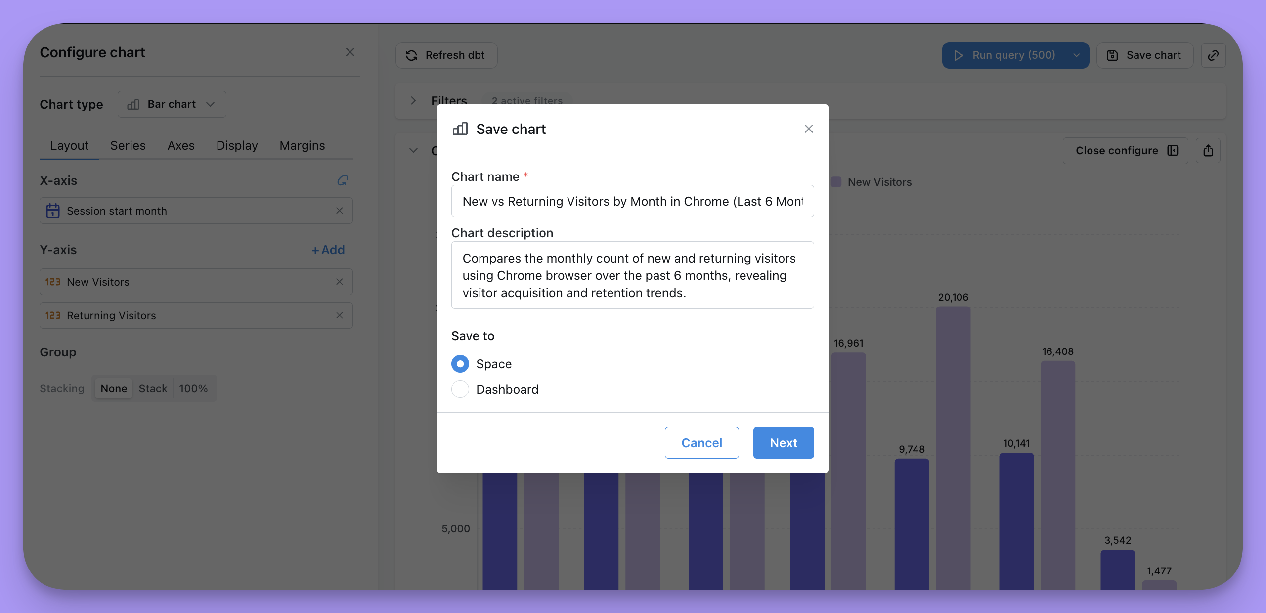
Save your chart
Saved Charts allow you to save a specific chart or table so you can share, add it to a dashboard, or revisit it again in future.
When you open a saved chart, it will always update to display the latest data in your database since it will re-run the query each time you open it.
To save a chart, click the Save chart button at the top of the page, then give your chart a useful name and description. You’ll have the option to save the chart to a Dashboard or a Space.
Once you save a chart, it unlocks these useful features:
Saving to a Dashboard
The majority of charts in Lightdash are saved directly to a dashboard. This option is better if your chart is only ever going to be used on one dashboard anyways. When you save a chart to a dashboard it doesn’t clutter up your Spaces with long lists of charts that only make sense in the context of a specific dashboard.
Saving a chart to a Dashboard means it only lives within that single dashboard. If you want to reuse it you’ll need to move it to a space or click Explore from here and create a new version of the chart.
Saving to a Space
Saving a chart to a Space means it can be shared individually and reused across multiple dashboards. This option is also the only way to pin a single chart to your project home page.
You’ll get a nice Saved chart view that you can use to share with others.
Changing the explore of an existing chart
Once a chart is saved, you can switch the explore (table) it is built on without having to recreate the chart. Open the saved chart, open the Change explore dialog, pick the new explore, and all field references will be remapped to it.
Tick Also update all other charts using this explore to remap every chart built on the current explore in one go — useful when an entire model is being replaced.
Fields that exist on the new explore with the same field IDs are kept; anything that doesn’t exist on the new explore is dropped, and you’ll need to re-pick the missing fields before saving.
A handy use case is migrating charts from one model to another — for example, when you rename a dbt model or replace it with a new version. Instead of rebuilding the charts from scratch, point them at the new explore and keep the configuration that still applies.