- Renaming the columns in your table.
- Showing and hiding the columns in your table.
- Showing and hiding the table name from the column labels.
- Showing and hiding the totals for your columns.
- Limiting the displayed rows to the first or last N (see Limiting displayed rows).
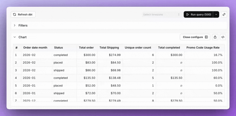
- Pivoting by a column.
- Transposing your table (a.k.a. pivoting your metrics)
- Locking a column from scrolling in your table.
- Resizing columns by dragging the column header edge.
- Adding conditional formatting to your cells.
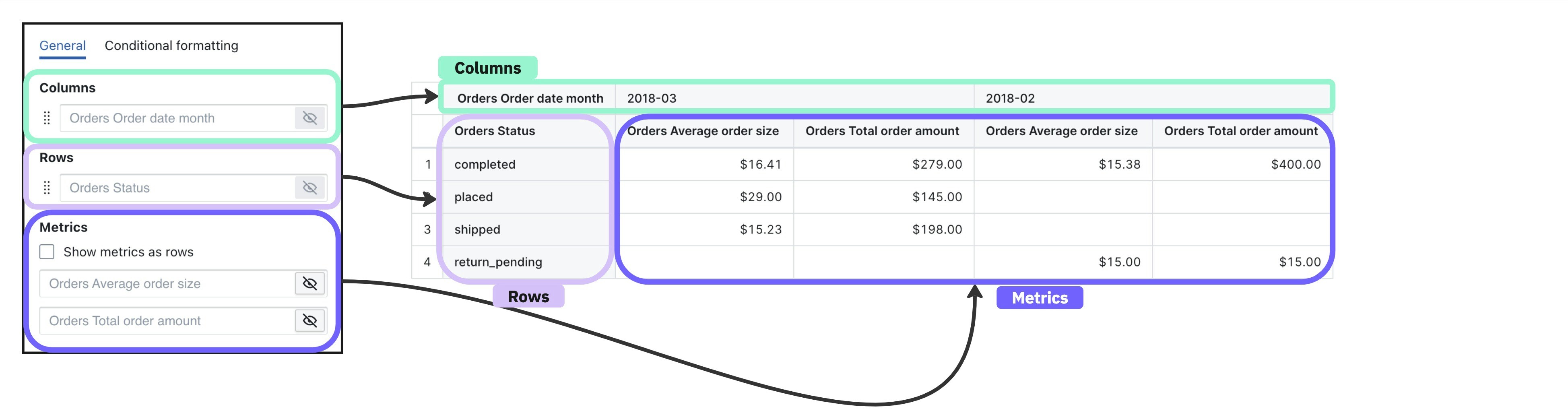
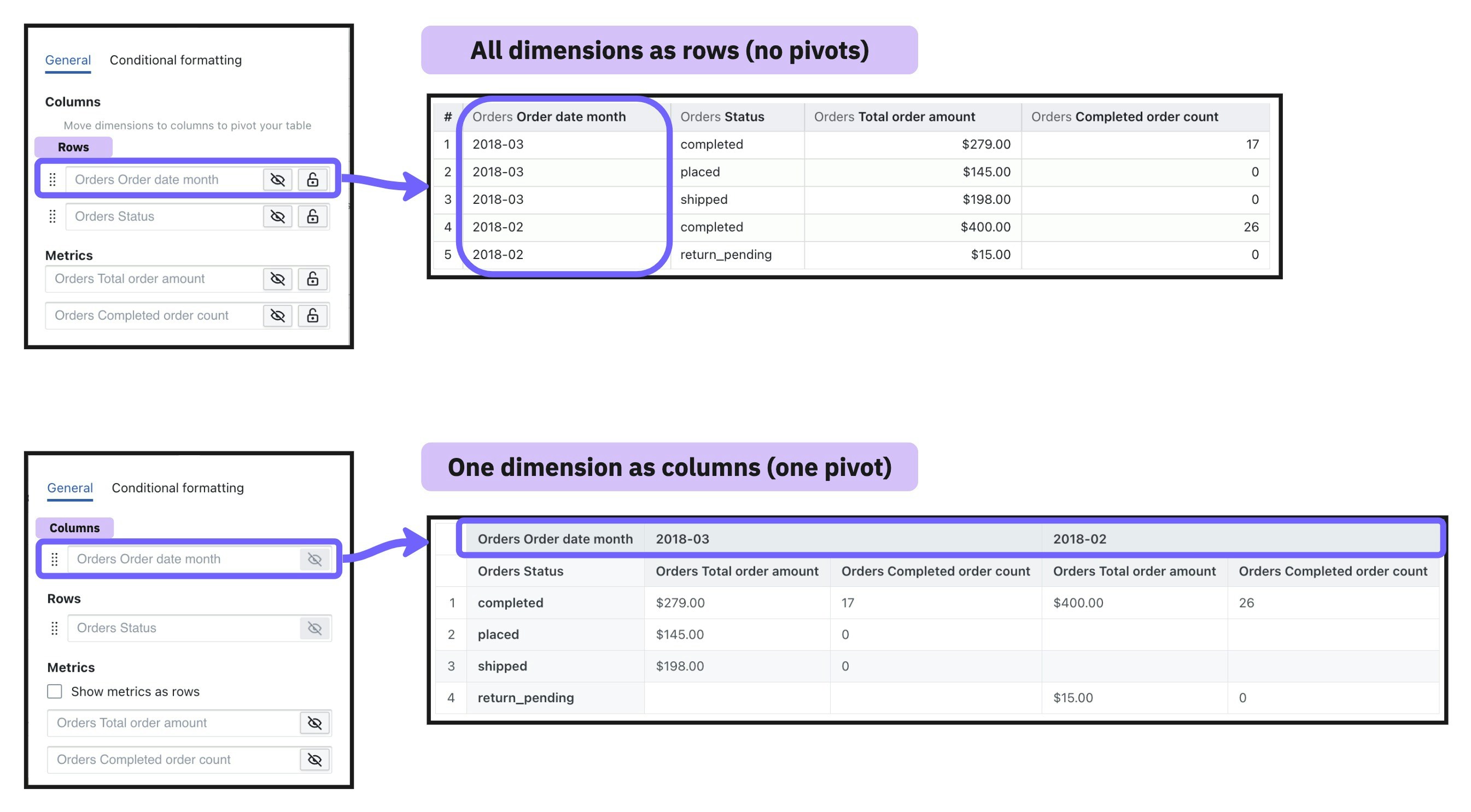
Columns, rows, and metrics
Table visualizations have three components:- Rows: When a field is chosen for the row area, all of the unique values for that field are populated as values in the rows of your table.
- Columns: When a field is chosen for the column area, all of the unique values for that field are populated as values in the columns of your table.
- Metrics: If you have metrics in your table, then each metric cell shows the summarized information for a given row + column combination.
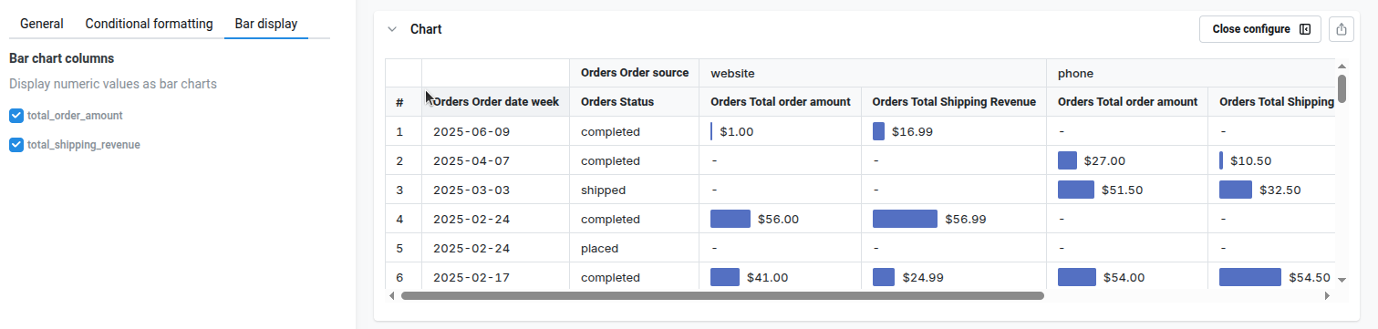
Adding tiny bars to table visualization
You can also enable tiny bars on each table cell, to improve visual feedback. To configure this, go tobar display on the sidebar, and select the numeric columns. We’ll calculate the min/max values , and we will display a tiny bar next to the value on the table
Limiting displayed rows
You can show or hide a slice of rows from the top or bottom of your table without changing the underlying query. The control lives in the Data section of the table configuration panel and is only available on non-pivoted tables — for pivot tables, use a query filter or the pivot column limit instead. The control reads as a sentence:- Show / Hide — keep only the targeted rows, or remove them.
- First / Last — anchor to the top or bottom of the results.
- N — how many rows to target (default 50).
| Setting | Effect |
|---|---|
| Show the first 50 rows | Display only the top 50 rows |
| Hide the last 1 row | Drop the bottom row (useful when the trailing period is incomplete) |
| Show the last 10 rows | Display only the bottom 10 rows |
The row limit only affects what’s drawn in the table. Your query still returns the full result set, totals are calculated against all rows, and CSV exports include every row.
Pivot tables
Pivot tables allow you to summarize larger sets of data in table visualizations by moving row values into columns. They’re also helpful to identify trends between two dimensions in your data using a table visualization. To add a pivot in your table, move a dimension to thecolumn section of your table configuration. This will change the dimension from having its values populate the rows values of your table, to having it populate the column values of your table.
Sorting pivot tables
Pivot tables support clickable header sorting. Click a column header in the pivot table to open a sort menu showing the available directions (for example,Sort A → Z / Sort Z → A, or Sort 1 → 9 / Sort 9 → 1 for numeric columns), a Remove sort option once a direction is active, and — for dimension columns — a Hide column option.
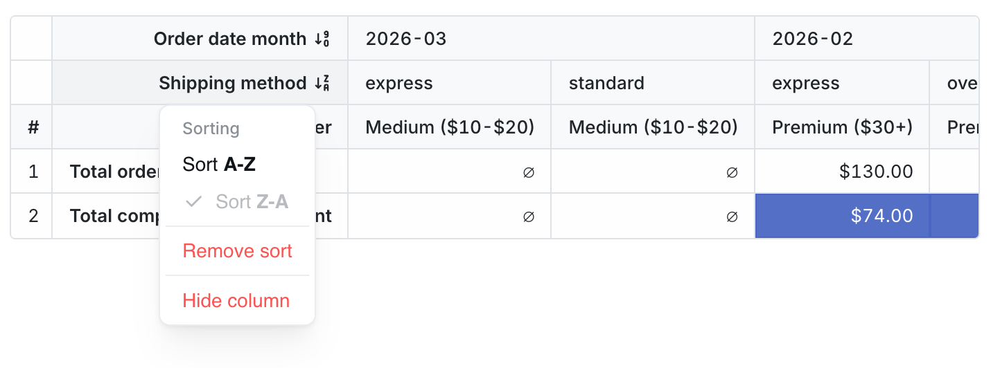
- Click a row-dimension header (the index columns on the left) to sort rows alphabetically or numerically by that dimension.
- Click a pivoted-dimension header (the dimension that was moved to
column) to sort the pivot column groups by that dimension’s values — for example, ordering pivot months chronologically or reverse-chronologically. - Click a metric value-column header (a cell underneath a specific pivot group, like
revenueunder2025-01) to sort the rows by that metric within that specific pivot group. Sorting by one metric column doesn’t reorder cells in the other pivot groups — it only changes the row order.
Header-click sorting is only available in edit mode and only on pivot tables. Flat (non-pivoted) tables use the sort pill above the chart — see the Explore sort menu. Saved charts and dashboard tiles render with the sort that was saved.
Hiding pivot dimension columns from the header menu
When sorting from a row-dimension or pivoted-dimension header, the menu also includes aHide column option. Hiding a dimension from this menu is equivalent to toggling its visibility off in the chart configuration panel — see Hidden dimensions and sorting below for how hidden dimensions still drive sort order and row grouping. The option is disabled for dimensions that are currently being used as a subtotal grouping level.
Hidden dimensions and sorting
You can hide a dimension column from a pivot table while still using it to control sort order. Toggle the column’s visibility off in the chart configuration panel — the dimension stops rendering as a row-index or pivot-column-header cell, and it’s excluded from CSV and XLSX exports, but it continues to drive the SQL sort order and row grouping behind the scenes. This is useful when you want to sort rows by a value you don’t want to display. For example, you can sort partners bypartner_id while only showing partner_name in the table.
Rows are still grouped using the full set of dimensions, including hidden ones. Rows with the same visible values but different hidden-dimension values are kept as separate rows rather than collapsed together.
Column limits
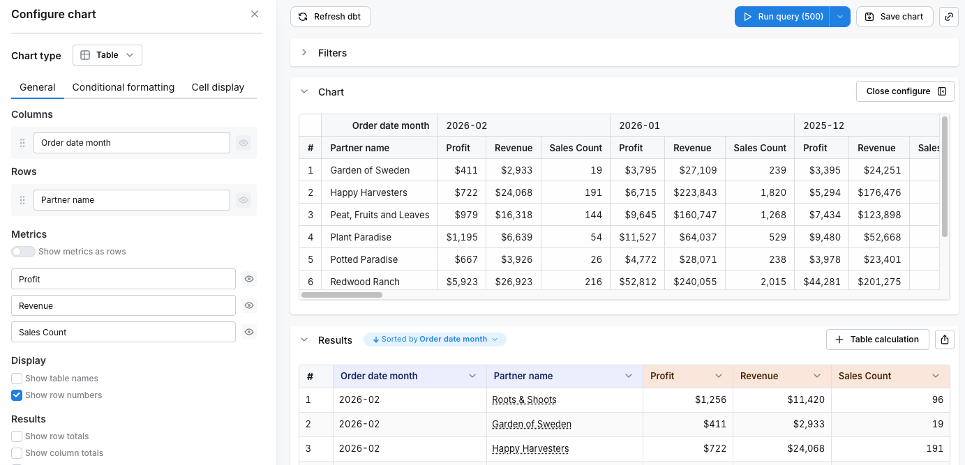
Pivot tables have a default limit of 200 columns to ensure good performance. Large pivot tables with many columns can significantly slow down query execution and rendering times, so this limit helps keep your dashboards responsive. The column limit works differently depending on whether you have metrics as rows or metrics as columns:When metrics are columns (default)
When metrics are displayed as columns (the default behavior), each pivoted dimension value creates a column for every metric. This means the total number of columns equals the number of unique dimension values multiplied by the number of metrics. For example, if you pivot byorder_date_month (with 36 months of data) and have 3 metrics:
- Total columns: 36 months × 3 metrics = 108 columns which is within the column limit of 200
- Maximum dimension values:
floor(200 / 3)= 66 months
order_date_month pivoted to columns and 3 metrics:
order_date_month and browser (with 6 distinct values) and have 3 metrics, the maximum number of months displayed is:
- Maximum dimension values:
floor(200 / (6*3))= 11 months
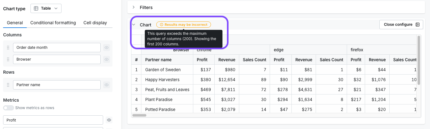
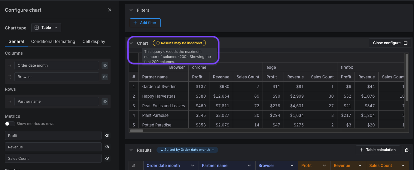
- filter your data, e.g., filter your months to only show data from the last year
- reduce the number of dimensions you are pivoting on, e.g., decide whether splitting your data by both
order_date_monthandbrowseris necessary - reduce the granularity of your pivot dimensions, e.g., pivot by
order_date_yearinstead oforder_date_month - show metrics as rows instead of columns (see below)
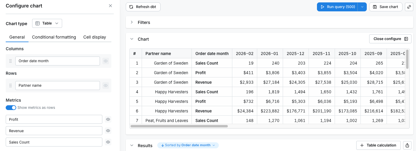
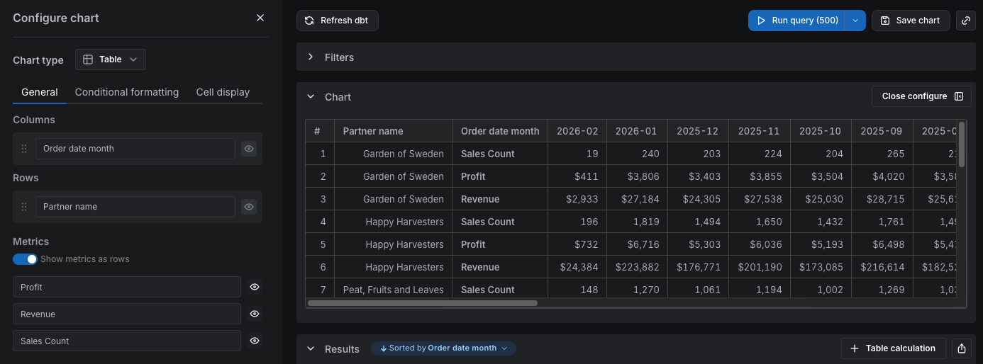
When metrics are rows
When you enable Show metrics as rows, each pivoted dimension value creates only one column, regardless of how many metrics you have. The metrics are displayed as separate rows instead. For example, if you havepartner_name as a row dimension (with 5 partners), pivot by order_date_month (with 12 months of data), and have 3 metrics:
- Total columns: 12 (one per month)
- Each row is repeated once per metric — so you’ll see 5 × 3 = 15 rows
partner_name:
Totals
You can add column totals or row totals (in pivot tables) to your tables by selectingShow column totals or Show row totals in the chart configuration panel. The column totals in your results and table visualizations are calculated using the underlying data from your table, not only the values that are visible in the table.
In pivot tables, both column totals and row totals are computed by running extra aggregation queries against your warehouse, so each total reflects the true value for that column or row rather than a sum of the cells shown. This means totals are accurate for count, sum, count_distinct, average, min, max, and ratio metrics in pivot tables, in both the metrics-as-columns and metrics-as-rows layouts. If the warehouse cannot return a value for a given total (for example, when a metric is not defined for that row), the cell is left blank rather than showing an incorrect sum.
Totals for table calculations
Lightdash computes grand, column, row, and subtotal values for a table calculation by re-applying it to the aggregated totals row (e.g.100 * sum(profit) / sum(revenue)) rather than summing the cells shown in the table.
A total is only produced when all of these are true:
- The calculation references only aggregated metrics — no dimensions, custom dimensions, period-over-period metrics, or other table calculations.
- It contains no window logic: no SQL
OVER (...)clause, no built-in row/pivot/total helper functions, and no formula aggregate or window functions. - The calculation is a SQL or formula table calculation — template table calculations are always excluded.
LAG / LEAD / ROW_NUMBER, percent-of-total helpers, and any calc that references a dimension or another table calculation.
Filters disable totals entirely
When the query has metric filters or table calculation filters, the totals row is omitted for the whole table — table calculation filters are applied after the calculations run, so the resulting totals would be inconsistent with the visible rows.
Incorrect totals
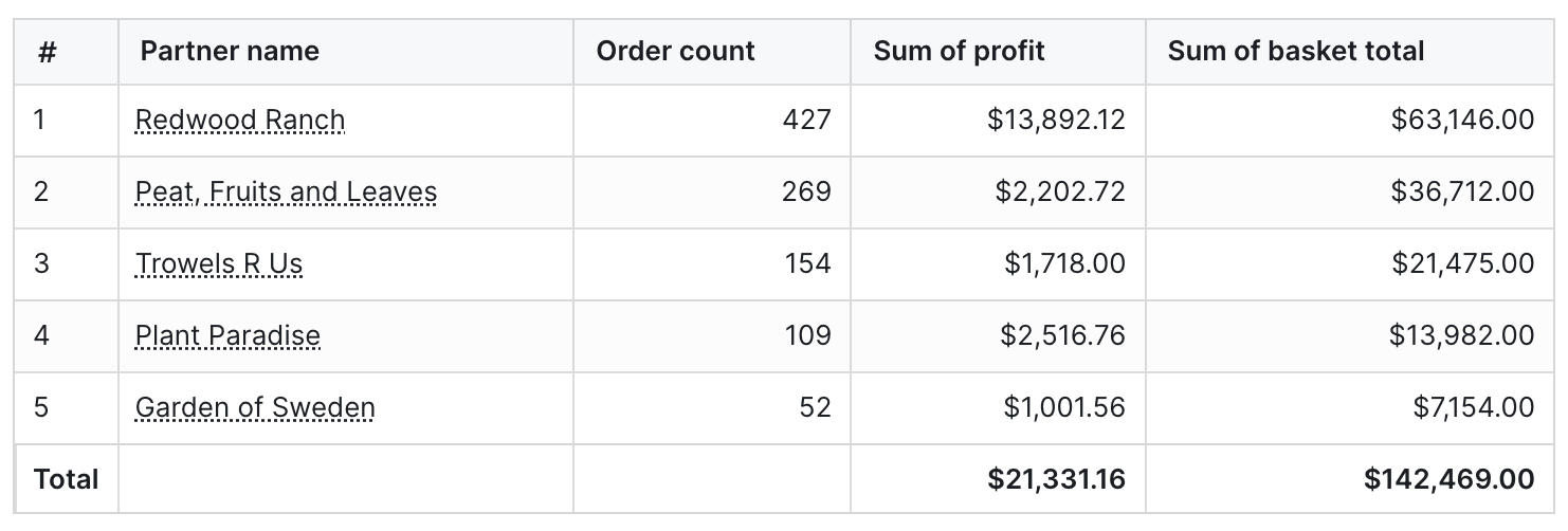
Why are my totals lower? When using thecount_distinct metric type, you can sometimes get totals that are smaller than if you sum up the values seen in the table.
For example, if you count the distinct number of devices that viewed pages on our website each month, it would look something like this:
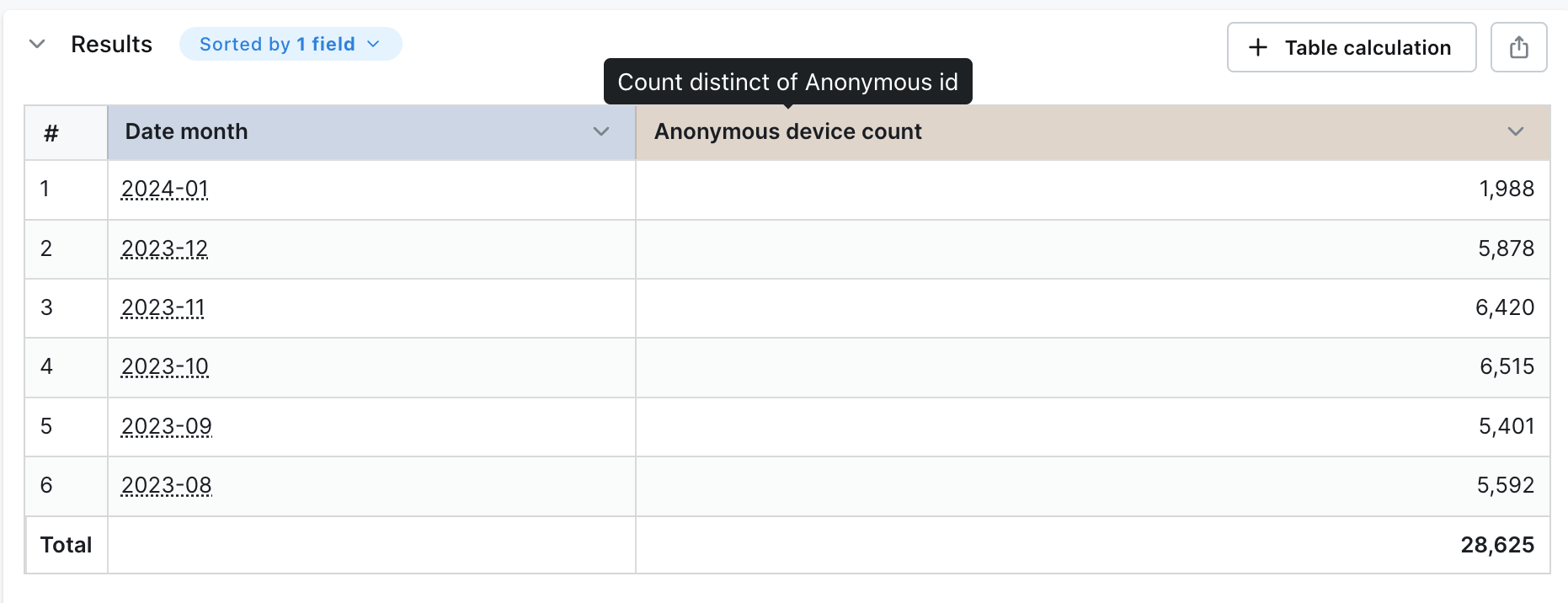
Anonymous device count column, the value you get is much higher than the total shown in the table. This is because the same device can view pages on our website across many months. So, when you add up the values in the table, you’ll be counting some devices more than once.
Lightdash uses a SQL query to calculate the distinct number of devices across all of the months so we avoid double-counting devices.
Why are my totals higher?
There are two reasons why this could be happening:
- You’ve set a row limit in your query that’s truncating the results. If the number of possible results from your query is larger than the row limit you’ve set, Lightdash will calculate the totals using all of the results (including the rows that have been removed from your table because of the limit).
- You’re using metric or table calculation filters. When you use metric or table calculation filters, the totals are calculated before the filters are applied.
This calculation isn’t a “true” total when you’re using metrics types that are
count_distinct!Subtotals
You can add subtotals to your tables by selectingShow subtotals in the chart configuration panel.
Expand subtotals by default
WhenShow subtotals is enabled, you can also enable Expand subtotals by default to control how subtotal groups render when the chart first loads:
- Off (default): subtotal groups load collapsed. Viewers click each group to expand it and see the underlying rows.
- On: subtotal groups load expanded, showing every row beneath each subtotal.
Show metrics as rows is enabled on a pivot table.
Group repeated row values
When a table has two or more dimensions, consecutive rows often share the same value in the outer dimension columns. EnableGroup repeated row values in the chart configuration panel to visually merge those repeated cells into a single cell that spans the run of rows, making the dimension hierarchy easier to scan.
- Flat tables: repeated values in all dimension columns except the last (leaf) dimension are merged. The leaf dimension stays per-row, since grouping it would produce one group per row.
- Pivot tables: repeated values in the row-index dimensions (the dimensions on the left, not the pivoted columns) are merged, again excluding the leaf dimension.
- You need at least two dimensions in the table for the option to be available.
- Row grouping is always on when
Show subtotalsis enabled — the checkbox is locked in that state because subtotals rely on the same grouping. - The option is unavailable when
Show metrics as rowsis enabled on a pivot table.
Freeze columns
If you have a wide table, you may want some columns to be locked to the left while you’re scrolling. Click on the lock icon beside the column(s) you want to keep pinned to the left of your table visualization to lock them in place.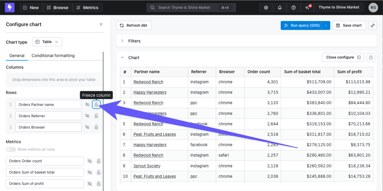
Resize columns
You can drag to resize columns in both pivot and non-pivot tables. This feature is available in Explore view when in edit mode. To resize a column:- Hover over the right edge of a column header to reveal the resize handle
- Drag the handle left or right to adjust the column width
- Release to set the new width
Conditional formatting
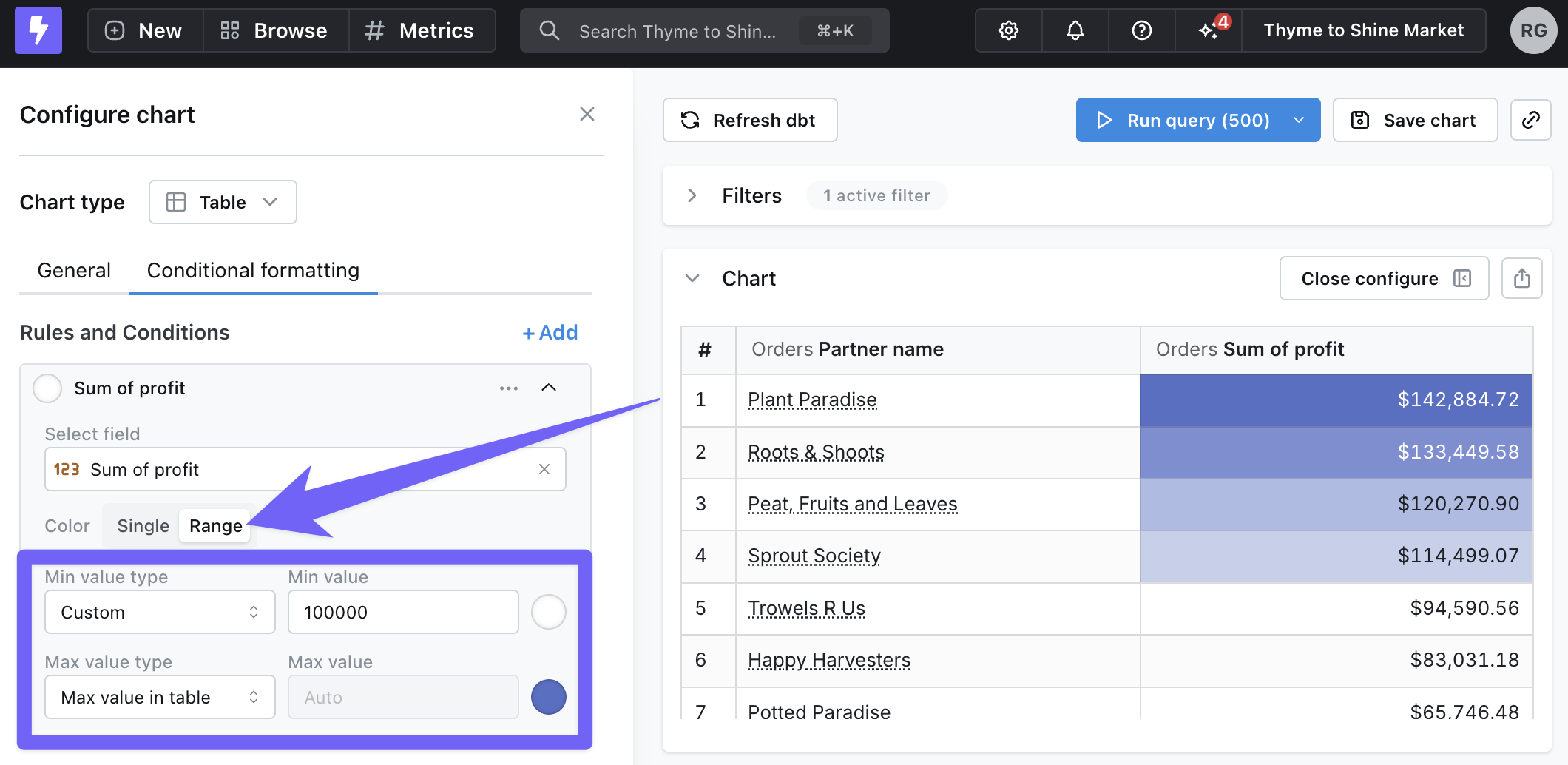
Sometimes it’s helpful to highlight certain values in your tables when they meet a specific condition. You can set up conditional formatting rules by going to the Configure tab, then Conditional Formatting.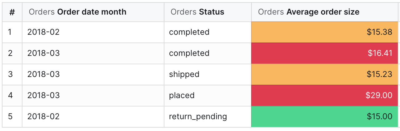
Highlighting cells
When you add a new rule, you’ll first need to pick which column should be highlighted and the type of rule you’d like to apply (Single or Range). There are three ways to compare data for each role:- Values compares the chosen field to manual input values.
- For example, color the
Profitcolumn red when a row is less than $10,000
- Field compares the chosen field to another field in your results.
- For example, color the
Revenuecolumn green when it is greater than theTarget revenuecolumn.
- Field values compares another field in your results to manual input values, then formats your chosen field.
- For example, color the
Partner namecolumn orange when theTotal orderscolumn is greater than 1,000.
Color ranges
To use color ranges for your rules, select Range under Conditional Formatting. You can choose specific minimum and maximum values, or you can automatically set them based on the values in your results.