Layout
This is where you can pick the columns from your results table that you want to plot on your x and y axes or that you want to group by. You can group by up to 3 fields in your chart. For bar charts, this is also where you have the option to stack your bars, or leave them unstacked (grouped).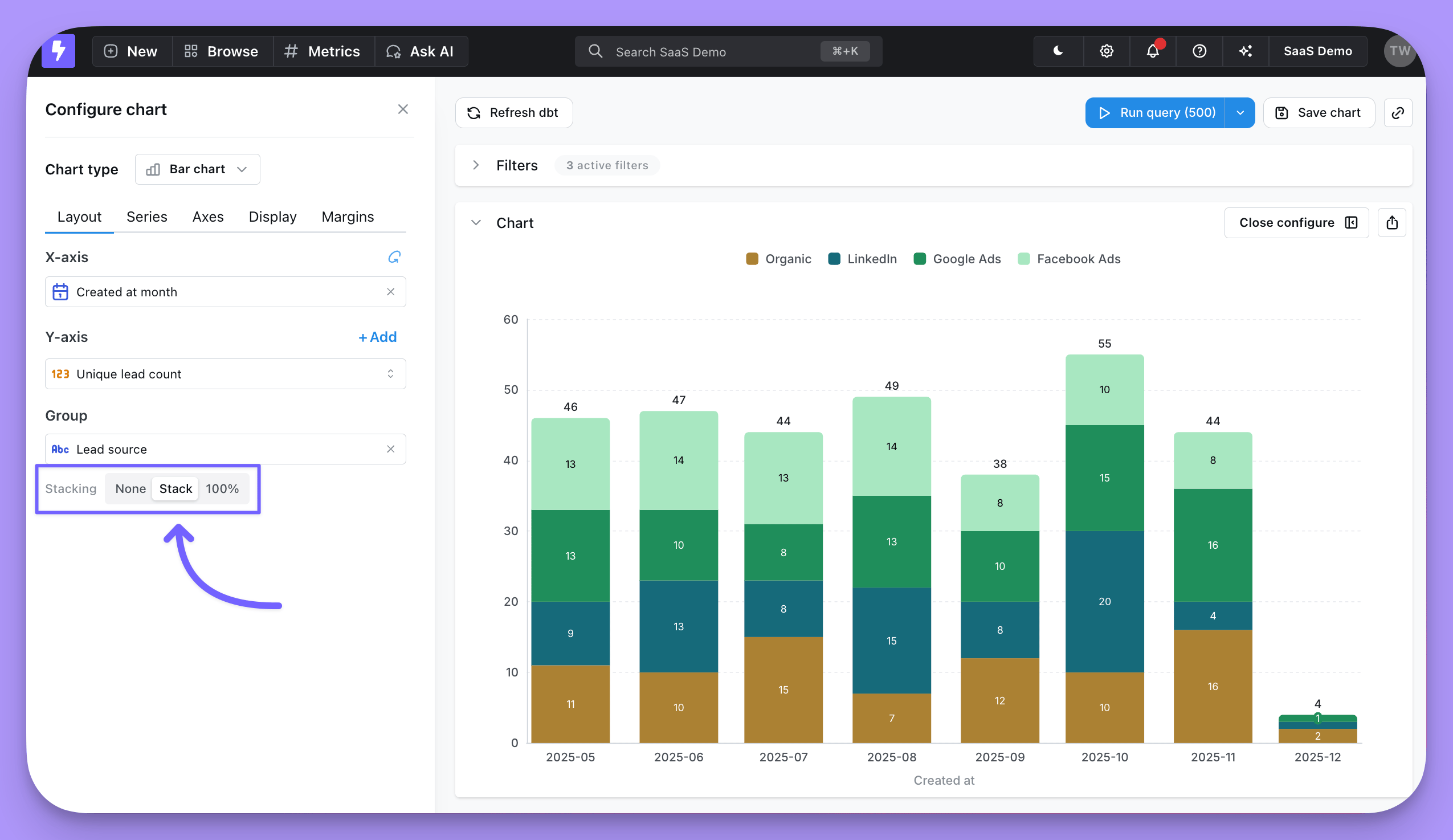
Series
The series tab is where you can adjust how your chart shows each data series. A data series is a set of related data points plotted on a chart. For example, the number of new users created each day over a set of dates is a series. In a bar chart, a series is represented by bars of the same color; in a line chart, a series is represented by a single line. You can see a list of the series for your chart in the Series menu, and on the chart legend.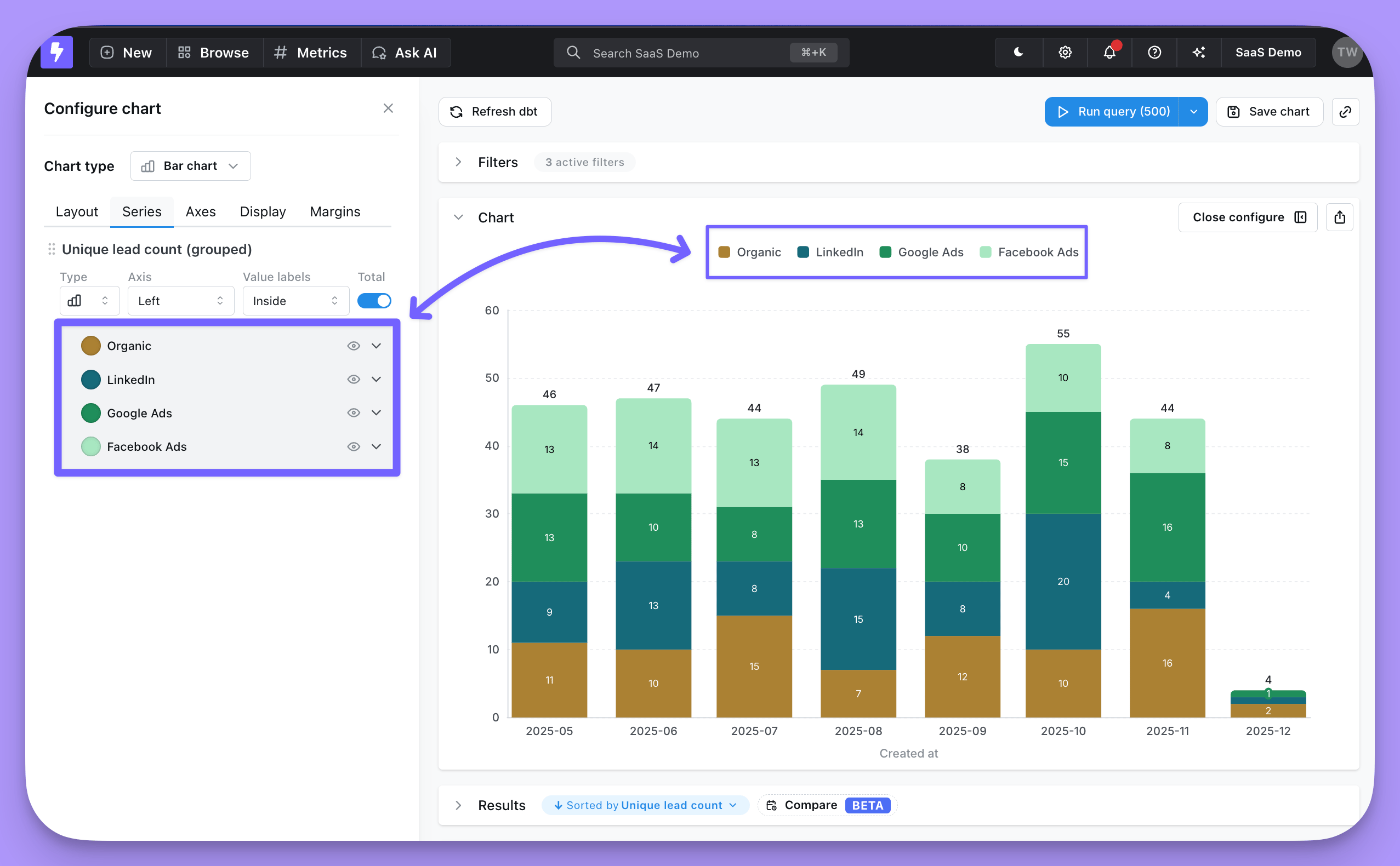
- Set the chart type for each series
- Change series labels or colors
- Put series on a left or right y-axis
- Show value labels or group totals on data points
- Hide a series from your chart
Custom colors (conditional formatting)
On bar charts, toggle Apply custom colors in the Series tab to recolor bars based on rules you define. Each rule targets a specific metric via the Target metric picker and only recolors that metric’s bars — other metrics keep their default colors, even where their values match the same condition. For example, on a chart withrevenue and orders bars grouped by product category, you can add one rule that turns revenue bars red when revenue is below 1000, and a second rule that turns orders bars orange when orders are below 50. Categories where only revenue is below the threshold keep the default color on their orders bar, and vice versa.
When to use it
- Conditional formatting — highlight bars whose value matches a rule (e.g. below target, above threshold). Available on bar charts with one or more metrics, including stacked and 100% stacked bar charts when the stack is built from multiple metrics. Every series on the chart must be a bar; mixed bar/line charts are not supported.
- Color by category — assign a fixed color to each x-axis category. Only available on single-metric, non-stacked bar charts. When both modes are available, use the Category / Conditional formatting toggle at the top of the section to switch between them.
revenue is less than 1000 colors a $900 segment even when it renders at the same height as an $1,100 segment in a different category.
Not yet supported: pivoted (grouped) stacks, and color by category on any stacked layout.
Configuring a rule
- In the Series tab, toggle Apply custom colors on. A new rule opens expanded so its inputs are immediately visible.
- Pick the Target metric the rule applies to. On stacked and 100% stacked charts this target is shared across all rules.
- Add one or more conditions (for example,
revenue is less than 1000) and choose a color. A rule with no condition filled in shows No condition set until you add one. - Add more rules for other metrics or other thresholds as needed.
Axes
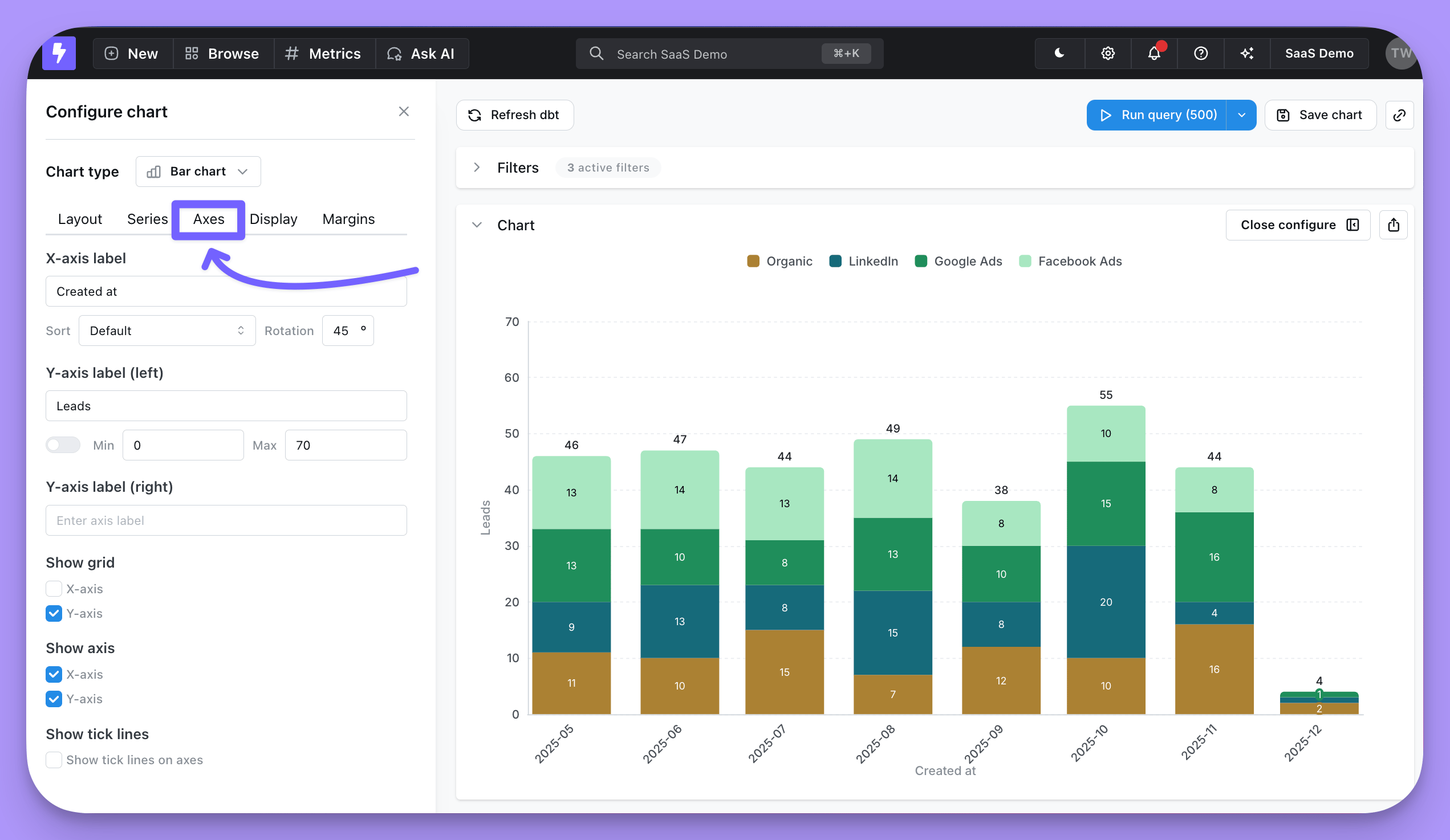
In this section you have options to:- Override the default text for your axes labels
- Adjust sort order of your x-axis
- Rotate x-axis labels
- Set the min and max axis values for your y-axes (or keep the default auto y-axis range)
- Set a minimum tick interval on numeric axes
- Show x-axis and y-axis grid lines
- Hide x-axis completely
- Hide y-axis completely
- Enable a scrollable chart for charts with many x-axis values
Min tick interval
Use Min tick interval to force a minimum step between ticks on a numeric axis. This is useful when the auto-scaled ticks show duplicate or decimal labels — for example, a count that only produces the values0, 1, 2 can otherwise render as 0, 0.5, 1, 1.5, 2. Setting the min tick interval to 1 forces integer-only ticks.
The control is available on each numeric axis (left/right y-axis, and top/bottom x-axis for scatter charts). Leave the field blank (or set it to 0) to let Lightdash pick the interval automatically.
Axis label format
Under each axis you can choose how tick labels are rendered:- None — show the raw numeric value.
- Percent — format the value as a percentage.
- SI — apply dynamic compact formatting. Values are automatically scaled and suffixed with
K,M,B, orTbased on their magnitude, so1,500becomes1.50Kand2,300,000becomes2.30Min the same axis.
Referencing the active granularity in axis and series labels
Axis names and series names support a${table_field.granularity} placeholder that resolves to the active date granularity (for example day, week, month) — including the granularity selected via date zoom. This lets a label like Orders per ${orders_order_date.granularity} render as Orders per week when viewers zoom to a weekly granularity.
See Referencing the granularity in chart labels for the full syntax and the complete list of supported labels.
Scrollable chart
For bar, line, and area charts with many x-axis values, turn on Enable scrollable chart to display a fixed-size window of data points that viewers can scroll through, instead of squeezing every value into the chart. When enabled, you can configure:- Initial scroll position — Choose whether the chart opens anchored to the Start (oldest or first values) or End (newest or last values) of the data. Use End for time series where the most recent values matter most.
- Visible items — Set how many x-axis items appear in the window at once (between 2 and 100, default 10).
Display
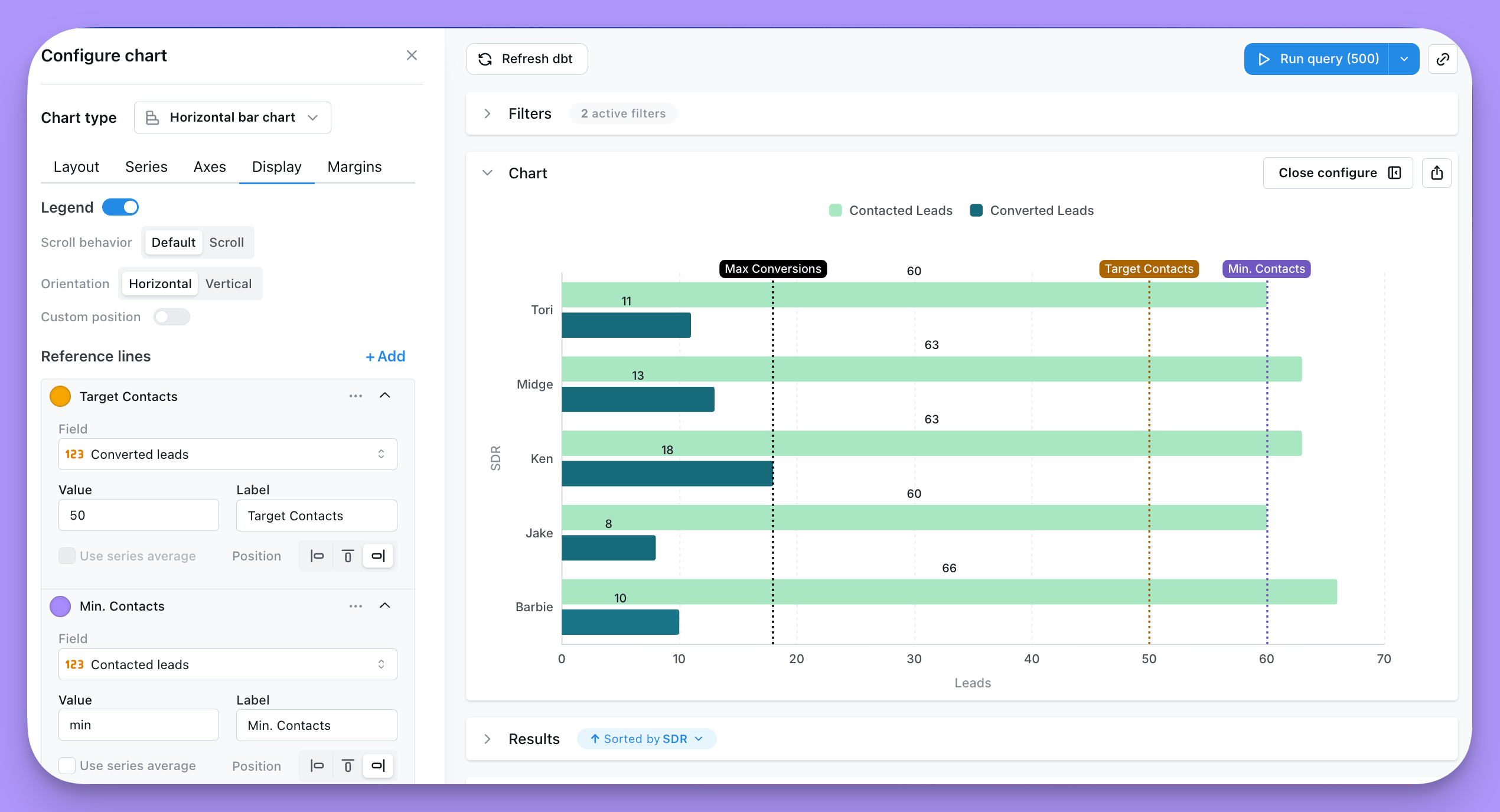
This tab is where you’re able to control the legend, reference lines, and custom tooltips in your chart.Reference lines
You can add reference lines to your charts to easily visualize goals or thresholds.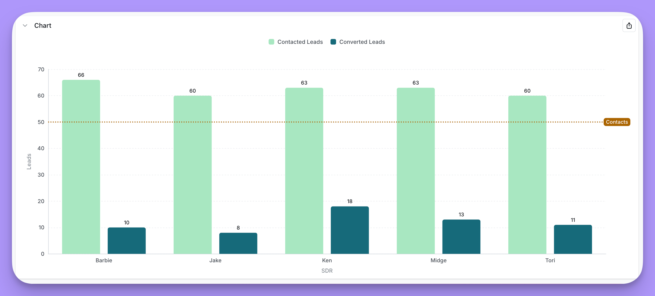
+ Add under Display -> Reference lines.
You have these options in the settings:
- Select a field you want to linke to your reference line (Page views in the image above)
- Set a static value (50,000 in the image above)
- Add a label (
Halfway to our goal!in the image above) - Change the line color (green in the image above)
Legend
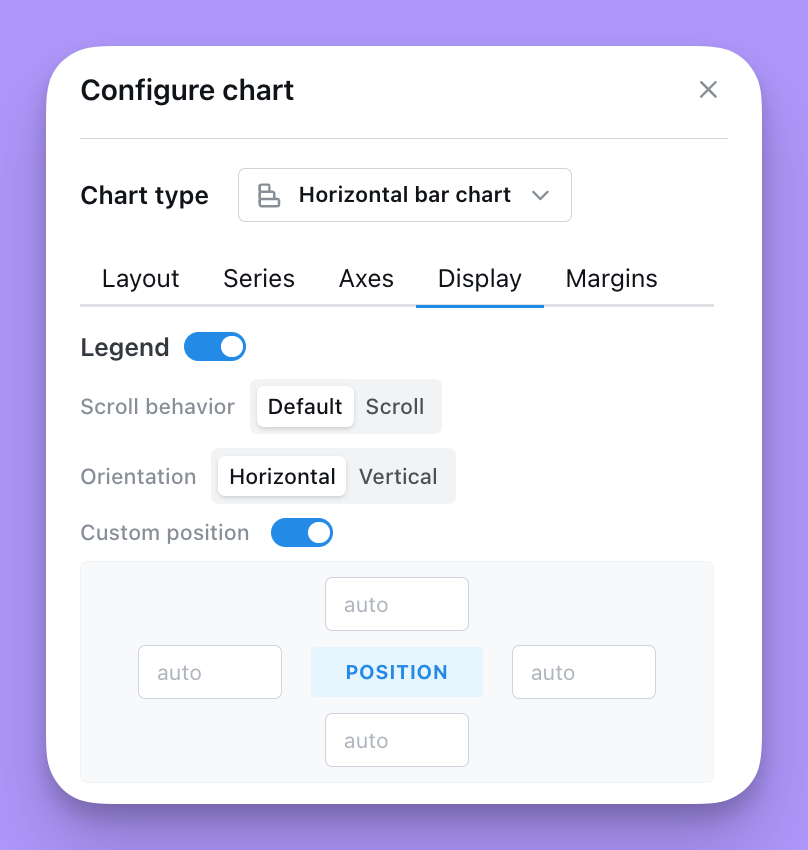
You can add and adjust the legend in your chart to help people understand what data’s been plotted.- Show or hide the legend
- Choose a Placement for the legend:
- Chart area overlays the legend on top of the plot. You can fine-tune its
position, scroll behavior, and orientation (see below). - Outside right or Outside left renders the legend beside the plot and reserves space in the chart grid so the legend never overlaps your data. When you pick an outside placement, set the Legend area width (in
%orpx) to control how much horizontal space is reserved for the legend.
- Chart area overlays the legend on top of the plot. You can fine-tune its
- When Placement is set to Chart area:
- Adjust the position of the legend on your chart. The values in
positionare the coordinates of the legend on your chart. They can either be numbers or percent. We suggest using %. - If you want the position to be in the bottom right, you would set: Right = 0%, Bottom = 0%. For the legend to be in the middle of the chart, you’d set: Top = 50%, Left = 50%.
- Set your legend to scroll (if you have so many groups that they overlap your chart).
- Orient the values in your legend to form a list vertically, or horizontally.
- Adjust the position of the legend on your chart. The values in
Saving the default legend selection
On cartesian charts (bar, line, area, scatter, mixed), the legend entries you toggle off in the chart editor are saved with the chart. When someone opens the chart again — in the explore view, a saved chart, or a dashboard — the same series start greyed out. Disabled series stay listed in the legend so viewers can still click them back on for their session; those ephemeral toggles are not written back to the saved chart. To change the default:- Open the chart in the editor.
- Click legend entries to disable or re-enable series. For example, on a chart pivoted by
product_category, click Apparel and Home Goods in the legend to focus on Electronics. - Click Save. The next time anyone opens the chart, only Electronics is plotted, with Apparel and Home Goods greyed out in the legend.
echartsConfig.legend.selected. It’s an optional map from legend entry name to boolean, and only entries set to false are stored — series that don’t appear in the map default to visible, so new series (for example a new quarter added to a pivoted chart) show up automatically. Re-enabling every series in the editor and saving removes the selected field entirely.
Data
The Data tab lets you trim what gets shown on the chart without changing the underlying query. Both controls run client-side on the already-fetched results, so totals, exports and underlying data are unaffected.Limit displayed rows
Toggle Limit displayed rows to show or hide a slice of rows from the top or bottom of your results.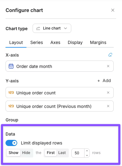
- Show / Hide — keep only the targeted rows, or remove them.
- First / Last — anchor to the top or bottom of the results.
- N — how many rows to target (default 50).
The row limit only affects what’s drawn on the chart. Your query still returns the full result set, totals are calculated against all rows, and CSV exports include every row.
Column limit
When your chart has a pivot dimension, the Column limit controls how many pivot groups (and therefore series) are drawn. Lightdash keeps the first N pivot groups in display order and drops the rest.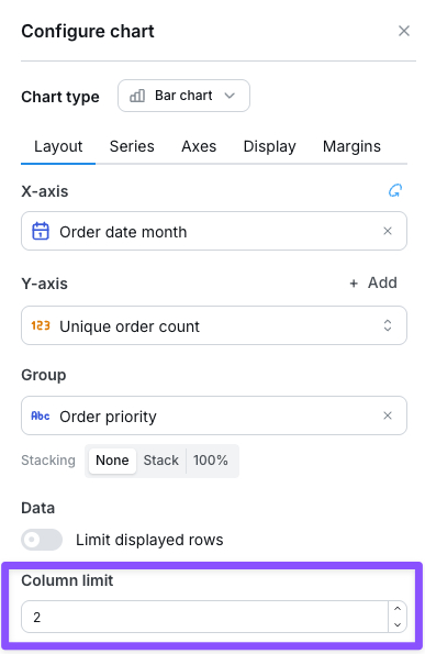
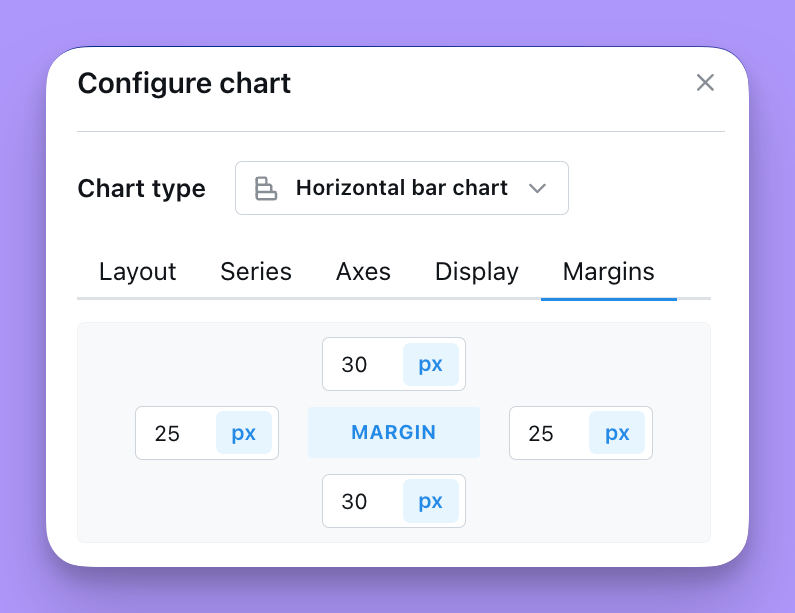
Margins
The Margin tab is where you’re able to add or remove margin around the grid. Removing margin means that your chart will fill more of the space in the chart tab. Adding margin will shrink your chart into a smaller space. You can either add numbers (e.g. 50) or percent values (e.g. 50%) to the margin settings listed. The default margin is set totop = 70, bottom = 30, left = 5%, right = 5%