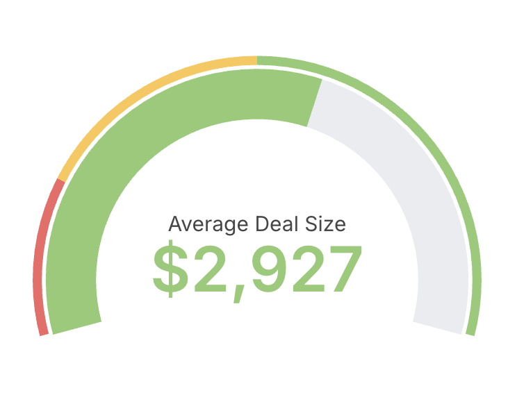
- Choose a single metric as the value to display.
- Optionally define min and max bounds for the scale.
- Configure colored ranges to communicate thresholds (for example: red, amber, green bands).
- Use gauges sparingly and for monitoring, not detailed analysis.
- Prefer descriptive labels and units so the value is immediately clear to viewers.
Referencing the active granularity in labels
The custom value label and custom percentage label support a${table_field.granularity} placeholder that resolves to the active date granularity (for example day, week, month) — including the granularity selected via date zoom. This can be set in Display configuration under Custom label.
See Referencing the granularity in chart labels for the full syntax and supported labels.