Spotlight
Spotlight is a suite of features designed to put Metrics front and center. It simplifies data exploration, making it easy for business users to focus on metrics without dealing with complex tables or time dimensions.
The Spotlight features are currently in beta.
We’re actively testing and improving them — some of the functionality might be subject to change.
Getting Started
Lightdash users don’t need to do anything to get started! Spotlight features use your existing Lightdash semantic layer and metrics definitions, so you can get started today.
Head to the Metrics Catalog under the Browse menu in the navigation bar.
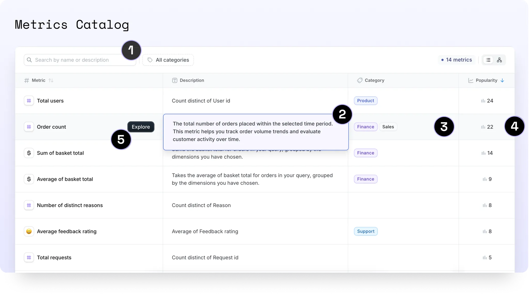
Browsing the catalog
Browse all the project metrics you have access to (based on permissions and user-attributes) in the Metrics Catalog.
-
Search: Easily find metrics by their names or .yml descriptions using the searchbar.
-
View .yml descriptions: Click on any description to expand and view the full content, including rendered Markdown.
-
Categories: Use categories to streamline your metrics and KPIs. Filter metrics by category and add new ones directly in the UI. Users with editor permissions and above can click on any category cell to edit, rename, change its color, or delete it.
-
View popularity: Discover a metric’s popularity and see where it’s being used. Click to explore a complete list of charts which use the metric. Metrics are sorted by default to highlight the most used ones first.
-
Explore: Interactive viewers and above can dive deeper by clicking Explore to visualize the metric in a chart format.
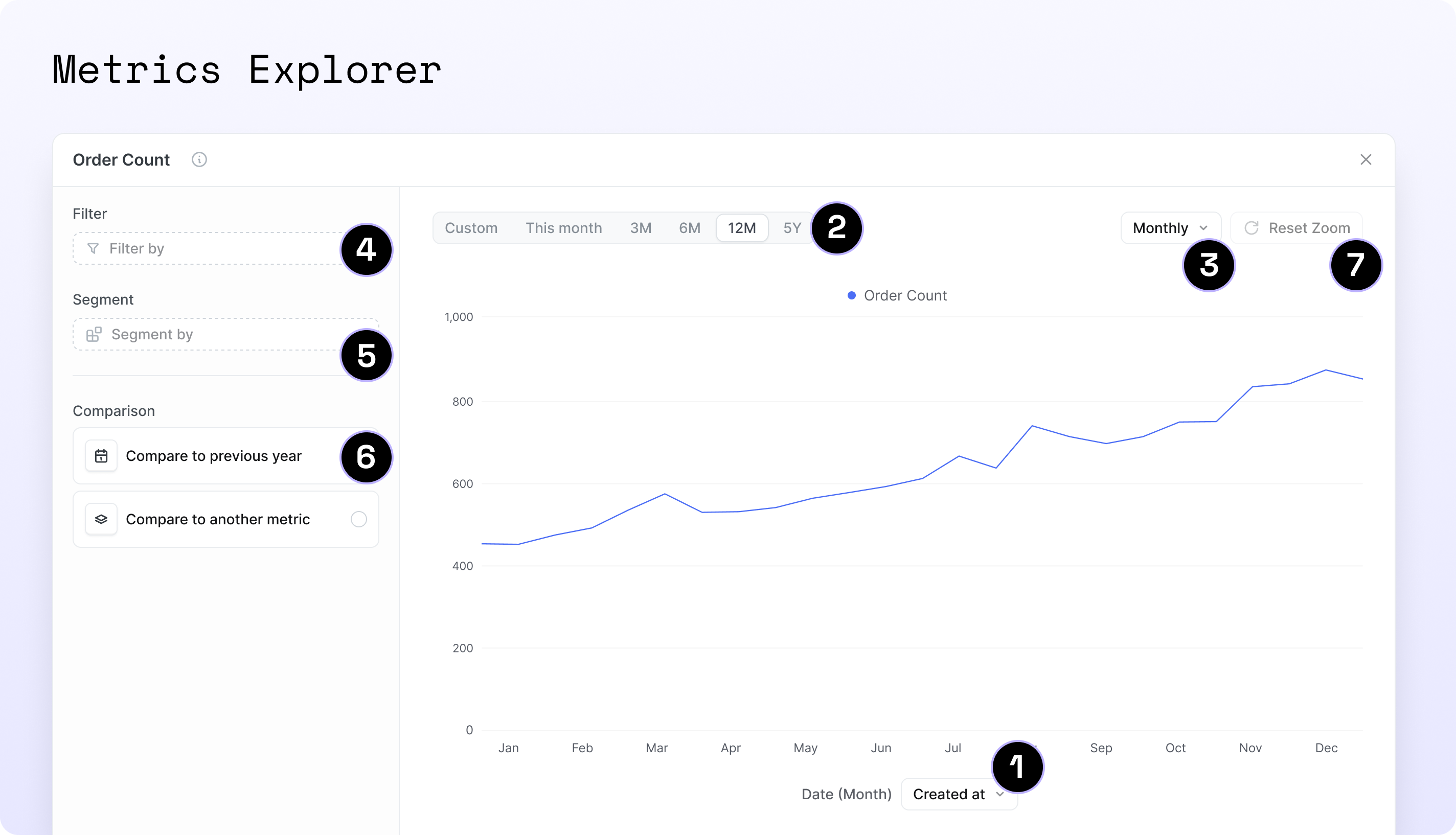
Exploring a metric
Visualize your metrics in the Metrics Explorer.
-
Plot over time: View your selected metric plotted over a time dimension as a line chart. You can adjust this dimension or set a default time dimension in your
.ymlto simplify the process for users. See how -
Filter by date: Use the date picker with convenient presets for quick selection. See how default presets work based on the granularity
-
Adjust the time granularity: Refine your view by choosing the desired level of date granularity.
-
Filter by a dimension: Filter your metric by any string or boolean dimension from the same table.
-
Segment-by: Break down the metric by any non-time dimension in your dataset.
-
Compare to:
-
‘This time last year’: Compare the selected time period to the same period last year
-
‘Another metric’: Compare to any other metric in the project that has a default time dimension specified in the
.yml. This includes joins See how
-
-
Drag to zoom: Click and drag across the chart to highlight the desired time range or data points, then release to zoom in on that segment. Hit ‘Reset Zoom’ to reset chart.
Curating Spotlight for your business users
Spotlight is designed to be a tool for your business users to explore and understand your data.
To make Spotlight more useful for your business users, you can curate the metrics they can see and explore.
To do this, you can:
-
Control the visibility of metrics in the catalog
-
Add categories to your metrics
-
Add default time settings to your metrics
All through your Lightdash .yml files.
Configuring global visibility of metrics
You can control the visibility of metrics in the catalog by creating a new file called lightdash.config.yml in the root of your dbt project.
See this video for an example on how to set this up:
Step-by-step guide
- Add the following to your
lightdash.config.ymlfile:
The default visibility can be set to show or hide.
If you don’t set this, the default visibility will be show, so all metrics will be visible in the catalog by default (but other settings like user attributes will still apply).
This will set the default visibility of metrics in the catalog to show for all metrics in your project. You can also set this to hide if you prefer to hide metrics by default and then override this on a per-model/metric basis.
- Now that you’ve set the default visibility, you can override this on a per-model/metric basis.
This will hide the events model from the catalog.
- If there are metrics in the events model that you want to make visible, you can override the default visibility for those metrics.
- Once you compile your project, you’ll see the
event_countmetric in the catalog, even though the events model is hidden.
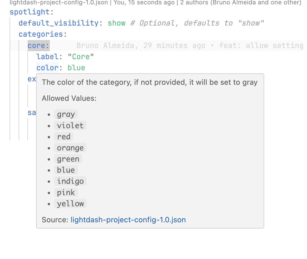
Assigning categories to metrics
Categories are a great way to organize your metrics in the catalog. You can create a new category by adding a new categories field to your lightdash.config.yml file.
Here’s a video showing how to set this up:
Step-by-step guide
- Add the following to your
lightdash.config.ymlfile:
- Now that you’ve added a category, you can assign metrics to it by adding a
categoriesfield to your models.ymlfile.
This will add the revenue category to all metrics in the events model.
If you want to add another category to a specific metric, you can do so by adding the categories field to the metric’s .yml file. And remember, you can only add categories that have been defined in the lightdash.config.yml file.
- Now you can add the
marketingcategory to theevent_countmetric: So in yourlightdash.config.ymlfile, you need to have another category. Let’s call itmarketingand add it to theevent_countmetric, like so:
Now you can add the marketing category to the event_count metric:
In this example, the event_count metric will have both the marketing and revenue categories, it’s cumulative.
- Once you compile your project, you’ll see the
event_countmetric in the catalog with both themarketingandrevenuecategories and you can use this to filter your metrics in the catalog.
The categories you define need to be unique, so you can’t have two categories with the same name.
If you try to add a category with the same name as an existing category, you’ll get an error. This error will be displayed in the UI and in the terminal (if you use the Lightdash CLI) when you compile your project.
Configuring default time settings in .yml
We recommend setting up default time fields to make it easier for your business users and save them time.
To pre-select a time field in the explore view, simply define the default settings in your Lightdash .yml files.
Set a table-level default time dimension
- Create or modify your table configuration in the .yml file. For example, to set a default time dimension on the events table:
- Add the default time dimension at the table level:
-
Navigate to the metrics catalog
-
Open any metrics from the events table
-
All metrics with that default time set will be plotted against the
event datewith day granularityin the last 30 days
Set a metric-level default time dimension
This will override the time dimension defined on the table level.
- Modify your existing table configuration to add a metric-level default time dimension:
-
Navigate to the metrics catalog
-
Explore the Events’ count metric
-
The metric will be plotted against the
event datewith month granularity, instead of the default day granularity applied to the table
Canvas view (alpha)
The Canvas View is a powerful, flexible workspace designed for visualizing and organizing metrics in creative ways. A key use case is creating Metric Trees to visualize metric relationships, hierarchies, and dependencies. This visualization enables you to see how metrics impact your KPIs and compare performance over the previous month.
How to use the ‘Canvas view’ for Metric trees:
-
Filter your metrics: Use the ‘categories’ or ‘search’ functions to narrow your list of metrics. Canvas view currently works best with fewer than 30 metrics to ensure smooth performance. Need help creating categories? Learn more here.
-
Enable Canvas view: Select Canvas view to activate the workspace.
-
Add metrics: Drag your desired metrics from the grey sidebar into the canvas workspace.
-
Create connections: Link metrics by dragging between nodes to build relationships and dependencies. Connected nodes will be saved and visible the next time you filter your metrics down by category.
-
Remove nodes: Select a node and press Backspace to delete it.
-
Permissions: Viewers can see trees created in the Canvas View but cannot make edits.
Canvas view is currently in alpha.
Your metric connections are saved, so the next time you filter by a category and switch to canvas view, you’ll see your saved connections. However, the placement of any unconnected tiles will not be retained.
FAQs
a. What time intervals are supported?
Currently, we only support: DAY, WEEK, MONTH, YEAR
b. What pre-filled filters are applied?
-
Time grain Year -> past 3 years
-
Time grain Month -> past 12 months
-
Time grain Week -> past 12 weeks
-
Time grain Day -> past 30 days
So if one of your business users explores a metric with a default time grain of DAY, metrics will be shown for the past 30 days with granularity of days with the default time dimension prefilled.
c. Can I pull through other metadata from my .yml files?
Not yet, but soon you’ll be able to manage metadata directly in the UI and sync it back to dbt.
d. Which other metrics can I compare my selected metric by?
-
Metrics with defaults in
.yml: Metrics with a default time dimension specified in the.ymlfile will always appear. -
Metrics with a single time dimension: Metrics from tables with only one time dimension will appear as it’s assumed to be the most relevant.
-
Metrics from joined tables: Metrics from joined tables that meet the criteria in points 1 and 2 will also appear.
e. How can I be sure that my yml changes are correct?
If you use VSCode, you can use our Lightdash schema validation to check your yml files are correct.
-
Install this YAML extention for VSCode: https://marketplace.visualstudio.com/items?itemName=redhat.vscode-yaml
-
Open you user settings in JSON format and add the following:
This will add schema validation to your model yml files and your lightdash.config.yml file.
-
Reload VSCode
-
You’ll see a red squiggly line under any errors in your yml files as well as suggestions for how to fix them and what is allowed.
Roles and permissions
| Action | Project Admin | Project Developer | Project Editor | Project Interactive Viewer | Project Viewer |
|---|---|---|---|---|---|
| Browse the ‘Metrics catalog’ | |||||
| Add/edit /delete ‘Categories’ | |||||
| Open the ‘Metrics Explorer’ |