

Homepage is available on Lightdash Enterprise. An organization admin must enable it for the organization before project homepages can be customized.
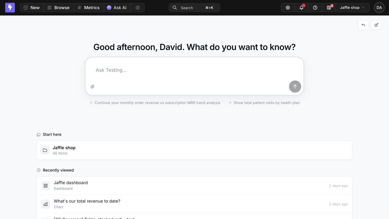
- What matters now: spotlight trusted metrics, important launches, and timely updates.
- Where to go next: guide people to dashboards, Spaces, data apps, learning materials, and external tools.
- What matters to each audience: publish a focused starting point for a team, group, or project role while personal blocks adapt to each viewer.
Homepage inspiration
- Executive pulse: lead with key Metrics, a verified dashboard Collection, and short data announcements.
- Team launchpad: publish by group or role with focused quick actions, Spaces, and each viewer’s favorites and recent work.
- Data onboarding: combine a hand-picked Start here Collection with Data Apps, videos, Claude Artifacts, documentation, and a glossary banner.
- Launch or campaign hub: pair a call to action with curated dashboards, supporting resources, and a scheduled announcement that also notifies Slack.
Enable Homepage
An organization admin can select the Homepage invitation on the classic homepage, choose an opening, and turn it on for all projects in the organization: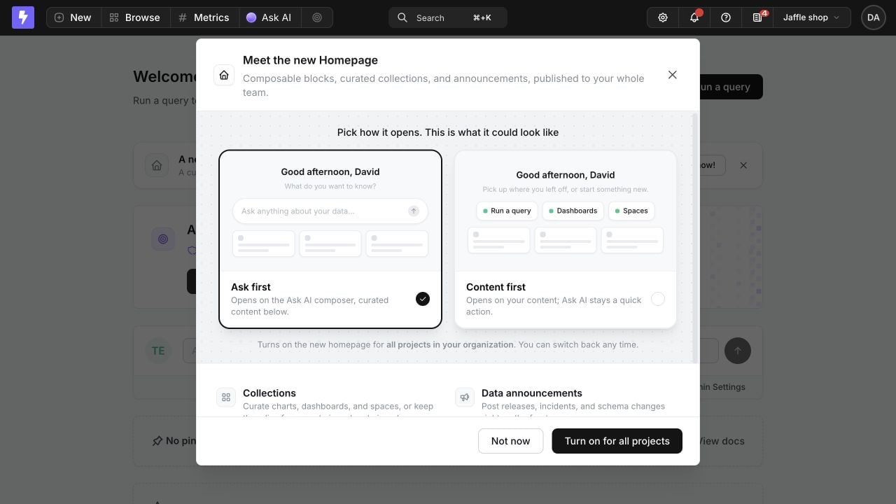
- Ask first opens with the Ask AI composer. This choice is available when AI is configured.
- Content first opens with a greeting and quick actions.
Build a homepage
Project admins, organization admins, and custom roles with Manage project homepage can select Customize homepage from the project homepage.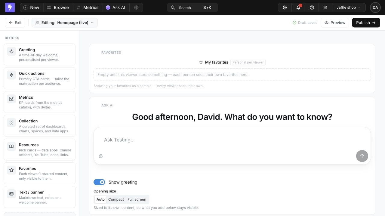
- Click a block to add it, or drag it to a specific position.
- Drag existing blocks between rows, or move them up and down.
- Add a second block to a row using the column control. A row supports up to two blocks.
- Edit each block directly on the canvas.
- Duplicate a block unless it is a singleton block.
- Remove blocks, revert unpublished changes to the published version, or delete the homepage.
- Preview the draft as everyone, a specific user, a group, or a project role.
Create more than one homepage
Open the homepage selector beside Editing, then select New homepage. Give it a name and start with a blank page or duplicate any existing homepage in the project. The same selector switches between homepages and identifies the project’s live default. There is no fixed application-level limit on the number of project homepages.Blocks
The block library provides 11 block types. Blocks whose content resolves to nothing are hidden on the published page, and a row containing only empty blocks collapses without leaving a gap.
Ask AI, Greeting, Call to action, and Announcements always occupy a whole row. Other blocks can share a two-column row. When Ask AI or Greeting leads the page, Lightdash treats it as the opening hero and sizes the rest of the page around it.
Ask AI and Greeting
Ask AI is a working composer, not a static shortcut. Viewers can start a conversation from Homepage, choose an available agent, use live suggestions, and access controls such as CSV attachment or deep research when those features are enabled for the project. The composer is intentionally inactive while editing in the builder. You can show or hide the personalized greeting above the composer and choose its opening size:- Auto keeps following content visible when the page has more blocks.
- Compact always uses the content-sized opening.
- Full screen fills the opening view and moves following content below the fold.
Quick actions
Quick actions are compact navigation chips for Ask AI, Run a query, Browse dashboards, Browse Spaces, a specific dashboard, a specific Space, or My space. Add, remove, and reorder actions, and emphasize one as the primary action. Ask AI actions are hidden automatically for viewers without AI access. My space opens each viewer’s own personal Space.Call to action
Use a Call to action for one prominent next step. The whole banner is clickable and can lead to Ask AI, Run a query, Browse dashboards, Browse Spaces, or a custom URL. External URLs open in a new tab.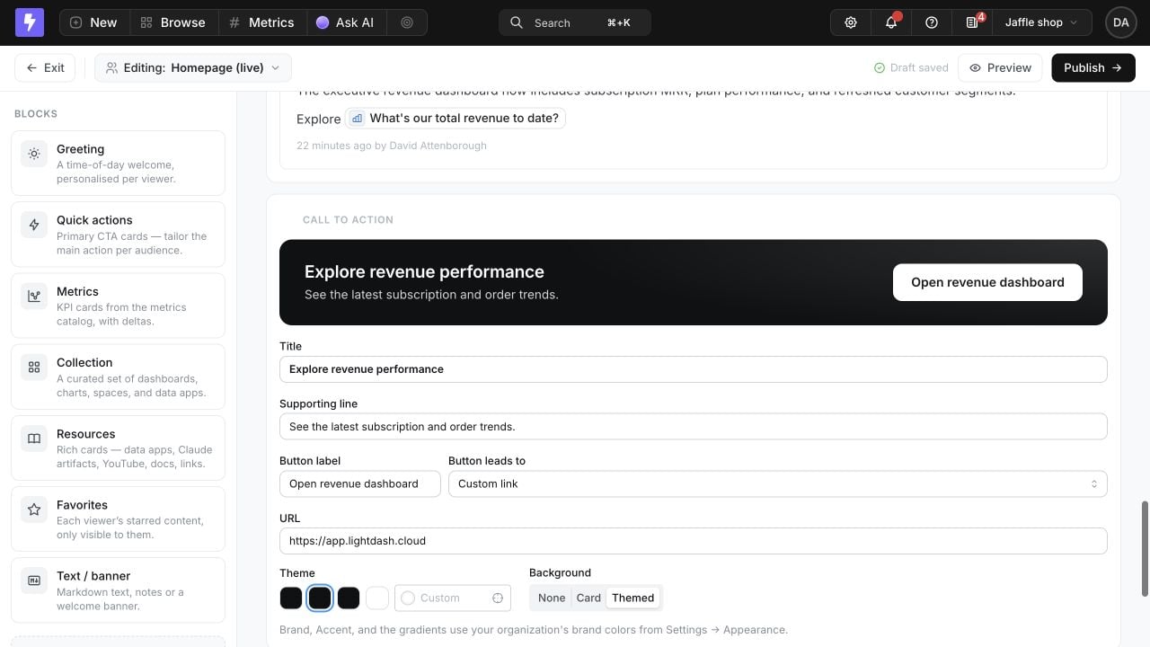
- Choose Brand, Accent, Dark, Neutral, or a custom color from the project palette. Brand and Accent follow the organization’s colors in Settings → Appearance, so a rebrand updates the CTA automatically.
- Apply the theme to the button only with None, place it on a neutral Card, or paint the whole surface with Themed. Lightdash chooses contrasting text and button colors automatically.
- Leave the title empty for a button-only CTA, then align it left, middle, or right.
Metrics
Use the Metrics block to curate a shared KPI pulse directly on Homepage. Select up to four metrics from the Metrics Catalog and give the block a title that matches the audience or workflow.
Collections
Collections are the main content-curation primitive on Homepage. Use a stable hand-picked list when order and editorial intent matter, or a live rule that refreshes whenever someone opens the page.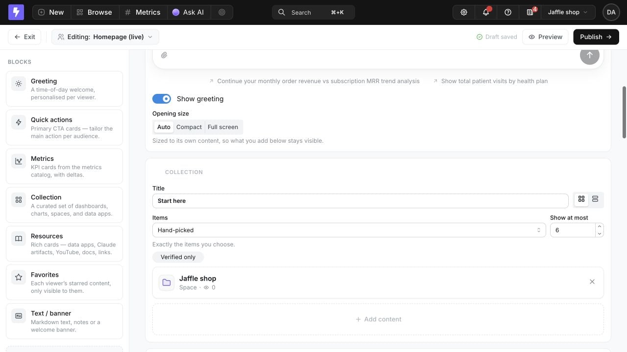
Live sources can be limited to charts, dashboards, data apps, or spaces, and can show only verified content. Collections show six items by default and can be configured to show up to 24.
For a hand-picked Collection, select Add content to browse charts and dashboards by Space or search data apps. You can also import the project’s current pins as a starting point.
Pin content
Editors, developers, admins, and custom roles with Manage pinned items can pin a saved chart, dashboard, space, or data app from its three-dot menu or header action menu. Select Pin to homepage or Unpin from homepage. Pins appear on Homepage only when its layout includes a Collection with Pinned as the source, or when they were imported into a hand-picked Collection. The live Pinned source tracks later changes automatically; importing pins creates a fixed snapshot.Resources
Use Resources to curate the tools and learning material that help people act on the data. A single block can mix saved Lightdash Data Apps with Claude Artifacts, YouTube videos, documentation, and other external links.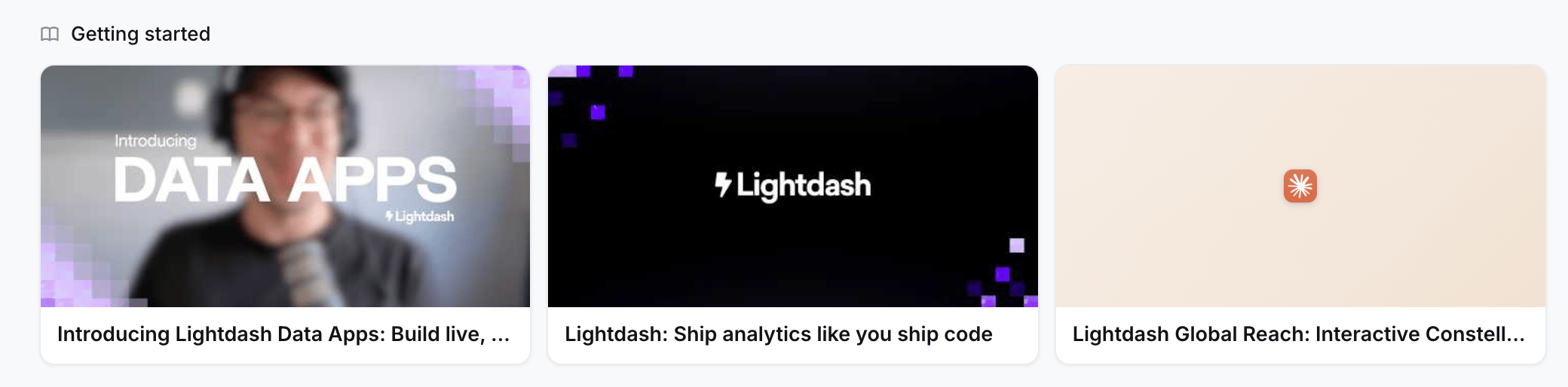
Data announcements
The Announcements block adds the narrative layer around the data: what launched, what changed, and what needs attention. Updates are authored and managed directly on Homepage.Configure an announcement
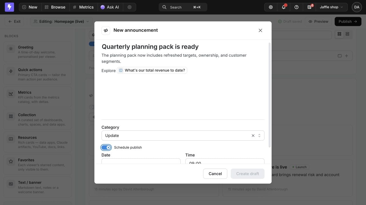
- Create Launch, Update, or Heads up announcements.
- Add Markdown, links, and uploaded images. Type
@to mention a project chart or dashboard so readers can open the referenced content directly. - Pin one announcement to the top, collapse older items, edit, or delete an announcement.
- Publish immediately or schedule publication for a future date and time.
- Choose a Slack channel to notify when the announcement publishes, when Slack is connected.
Preview published announcements
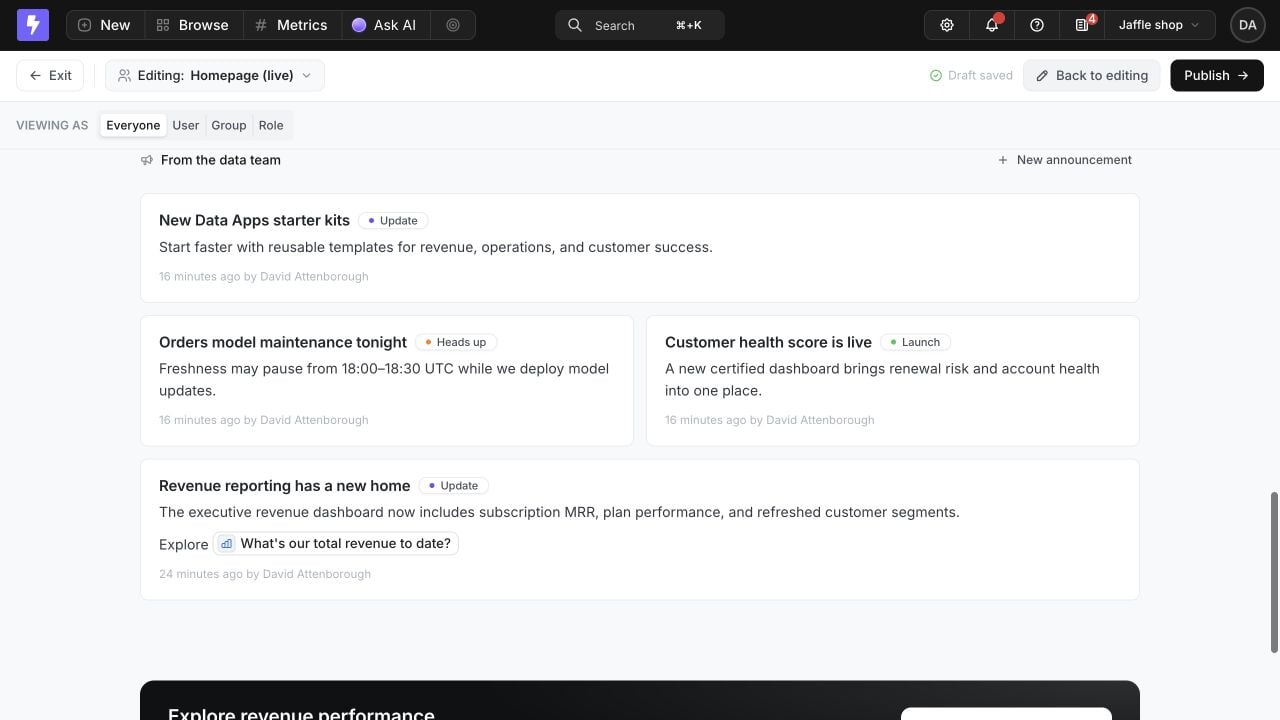
Select Preview to check the complete announcement layout. Published announcements appear without a Draft label, keep their Launch, Update, or Heads up styling, and render@ mentions as links to the referenced content.
Publish draft announcements
Draft announcements are visible only to homepage managers. Publishing the homepage also publishes all draft announcements in the project and sends any queued Slack notifications. The Publish dialog reports these pending actions before confirmation.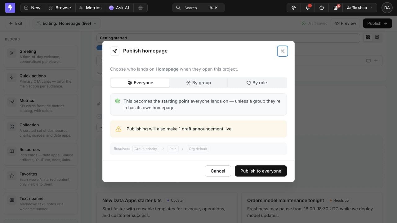
Text and banners
Use Text / banner blocks for editorial context that does not belong in a data object: explain a workflow, add definitions, welcome a team, or divide the page into sections. The rich Markdown editor supports headings, bulleted and numbered lists, quotes, code blocks, dividers, links, and uploaded images. Type/ to open the block menu, and use {name} to insert each viewer’s first name.
Personal blocks
Favorites, Recently viewed, and Collections sourced from Favourites or Recently viewed are resolved separately for every viewer. In the builder, Lightdash shows the editing admin’s personal content as a sample. When previewing another user or audience, personal blocks become placeholders. Preview resolves which homepage that audience would receive without revealing another person’s favorites or browsing history. If the published layout does not contain a Favorites block, Lightdash adds a compact personal Favorites strip above the opening hero when that viewer has favorites.Preview and publish
Select Preview to see the draft on the real homepage surface. Use Viewing as to check the result for:- Everyone
- A specific user
- An organization group
- A built-in project role
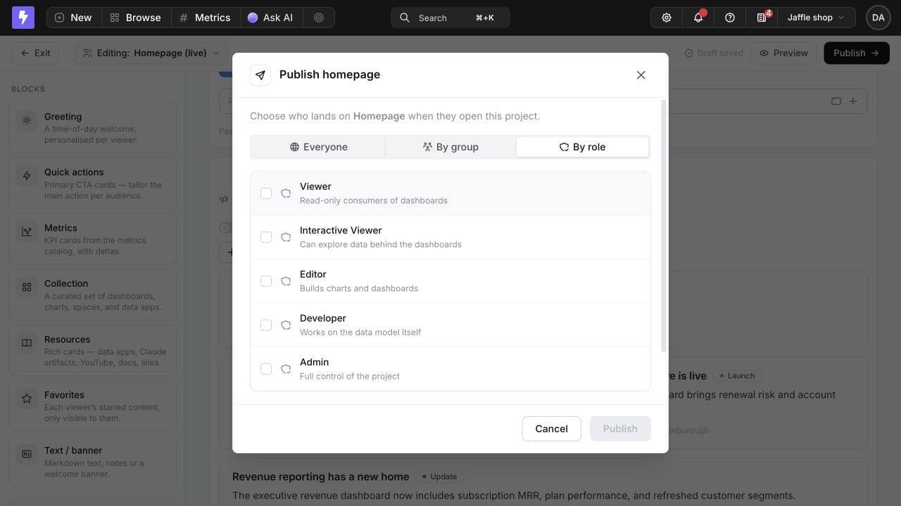
When more than one homepage could apply, Lightdash resolves the landing page in this order:
- The viewer’s highest-priority assigned group.
- The viewer’s built-in project role.
- The project’s default homepage.
Permissions and content access
Publishing to an audience chooses which homepage its members land on. It does not grant access to the project or to content referenced by the page.
Lightdash checks each viewer’s existing permissions when resolving Collection items. Inaccessible or deleted content is omitted, so two people assigned the same homepage can see different cards. Links to charts, dashboards, spaces, data apps, metrics, and AI also keep their normal feature and content permissions.
Homepage is an authenticated project landing page. It does not create a public share link.