> ## Documentation Index
> Fetch the complete documentation index at: https://docs.lightdash.com/llms.txt
> Use this file to discover all available pages before exploring further.
# Gauge
> Use gauges to highlight a single value against a qualitative range, like performance against a target
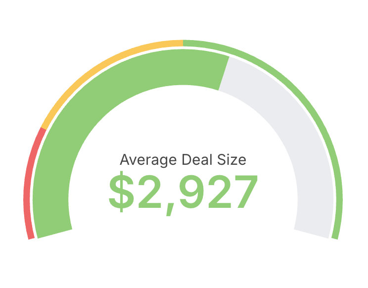 Gauges are useful when you want to highlight a single value against a qualitative range, like performance against a target. They work well for KPIs and operational dashboards where you need an at-a-glance status.
To create a gauge chart:
* Choose a single metric as the value to display.
* Optionally define min and max bounds for the scale.
* Configure colored ranges to communicate thresholds (for example: red, amber, green bands).
Tips:
* Use gauges sparingly and for monitoring, not detailed analysis.
* Prefer descriptive labels and units so the value is immediately clear to viewers.
## Referencing the active granularity in labels
The custom value and percentage labels accept the `${table_field.granularity}` placeholder to show the active date granularity — set it in Display configuration under Custom label. See [Referencing the granularity in chart labels](/explore/dashboards/date-zoom#referencing-the-granularity-in-chart-labels) for the full syntax and supported labels.
Gauges are useful when you want to highlight a single value against a qualitative range, like performance against a target. They work well for KPIs and operational dashboards where you need an at-a-glance status.
To create a gauge chart:
* Choose a single metric as the value to display.
* Optionally define min and max bounds for the scale.
* Configure colored ranges to communicate thresholds (for example: red, amber, green bands).
Tips:
* Use gauges sparingly and for monitoring, not detailed analysis.
* Prefer descriptive labels and units so the value is immediately clear to viewers.
## Referencing the active granularity in labels
The custom value and percentage labels accept the `${table_field.granularity}` placeholder to show the active date granularity — set it in Display configuration under Custom label. See [Referencing the granularity in chart labels](/explore/dashboards/date-zoom#referencing-the-granularity-in-chart-labels) for the full syntax and supported labels.